It’s a brand manager’s nightmare: your reprint order arrives, but the color is visibly different from the first batch. This guide explains exactly why this color shift happens and gives you the 3-step professional framework to guarantee perfect batch-to-batch consistency.
Reprints look different due to inevitable industrial variables. The paper batch whiteness changes, ink pigments vary, and the press environment (humidity) alters dot gain. Because these factors change between your first and second print run, the only way to ensure consistency is to provide a physical master sample from the first batch for the printer to match.
Keep reading to learn the 3-step professional SOP (including the “Master Sample” rule) that separates amateur reorders from guaranteed brand consistency.
The “Why”: 5 Industrial Variables That Break Your Brand Consistency

You sent the exact same file. So why is the result different?
The answer is that your file is a digital constant, but printing is a physical, industrial process full of variables distinct even from the basic challenge of translating screen color to print. Your first print run was one unique “event.” Your reprint, six months later, is a *second, completely separate event*.
Your brand consistency is being broken by five real-world variables that your digital file simply cannot control.
1. Paper Batch Variation (The “White” Isn’t the Same White)
This is the most common and most overlooked culprit. You specified a “157gsm matte art paper,” but the paper used for your reprint came from a different manufacturing batch. Paper is a natural product, and paper mills have an acceptable tolerance. For CIE Whiteness, a variation of ± 3 to 5 points between batches is normal.
To the naked eye, a 3-point shift is clearly visible. It means your first run might have been on a cool, blue-white stock (e.g., 98 CIE Whiteness), while your reprint is on a warmer, cream-white stock (e.g., 95 CIE Whiteness). When you print your brand’s blue ink on a yellow-white base, it will inevitably look slightly greener. This isn’t a printing error; it’s a materials problem.
2. Ink Batch Variation (The “Pigment” Isn’t the Same Pigment)
Just like house paint, printing inks are mixed in large industrial batches. The “Pantone 286 Blue” mixed in March may have a microscopically different pigment composition than the batch mixed in September. When placed side-by-side, this tiny variation in the ink itself can be visible.
3. Press Environment (Humidity & Temperature)
Offset printing is a delicate chemical process balancing ink and water. Paper is a sponge for moisture, and its properties change drastically with the environment. The ideal pressroom is a stable 45% – 55% relative humidity (RH).
Now, consider your timeline:
- Your 1st Run (February): The air is dry (30% RH). The paper is crisp and absorbs ink predictably. Your dot gain is a controlled 12%.
- Your 2nd Run (August): The air is humid (70% RH). The paper fibers are swollen with moisture. This moisture repels the oil-based ink, causing dot gain to skyrocket to 18%-20%.
This 6-8% jump in dot gain means all your mid-tones just got significantly darker. It’s the technical reason your “perfect file” now looks muddy and dark—the physics of the pressroom changed.
4. Machine Calibration & Wear
A printing press is a massive piece of mechanical equipment that runs 24/7. Even with daily calibration, its components (like blankets and rollers) wear down.
As printing consultant Ron Ellis notes, “A press calibrated in January will drift by June due to environmental changes and mechanical wear.” The machine your job is run on in October is physically different than it was in January.
5. The “Changing Printers” Trap
This is the single biggest variable. If you took your reprint order to a new, cheaper printer to save money, it is almost impossible to get an exact match.
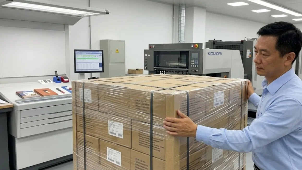
Even with the same file, their factory uses different ink brands, different paper suppliers, different press models (e.g., Heidelberg vs. Komori), and different color management software. Expecting a different factory to perfectly replicate another’s work is a setup for disappointment.
A Case Study in Failure: The “New Printer” Trap
We recently consulted for a startup that had just raised a new round of funding. They had a beautiful product box from their first (expensive) domestic print run. To save costs, they took their “perfect” box and the digital file to a new, cheaper offshore factory for their mass-production reprint.
The result was a disaster. The new factory’s boxes were visibly different—the brand’s signature gray looked flat, and the logo’s red was slightly off. Why? The new factory used a different paper supplier (a warmer white stock), different ink brands, and their presses were calibrated to a different standard. They were trying to “eyeball” the match.
The startup had to reject the entire 10,000-unit run. They learned a hard lesson: the “savings” from a cheaper printer are worthless if the final product fails to match your established brand color. A consistent partner is always cheaper than a reprint.
| The Variable | How It Breaks Consistency | The Professional Solution |
|---|---|---|
| Paper Batch | The “white” base color shifts (e.g., warmer or cooler). | Match the “Master Sample,” not the file. |
| Press Environment | Humidity changes dot gain (making prints darker/muddier). | Use the Master Sample to adjust ink density on press. |
| Ink Batch | Pigment formula has micro-variations over time. | Visually match the Master Sample under standard light. |
| Different Printer | Different machines, paper, inks, and calibration. | Stick with one color-managed partner; or pay for a new Press Check. |
Your Action Plan: The 3-Step SOP to Guarantee Reprint Consistency

So, how do you fight back against these physical variables? You stop relying on a digital file and adopt the 3-step process that professional brand managers use to enforce consistency.
Protect Your Brand on Every Print Run
Your brand’s color is its most valuable asset. Our quality control process is built to manage these variables, ensuring your reprints always match. Let’s discuss your next project.
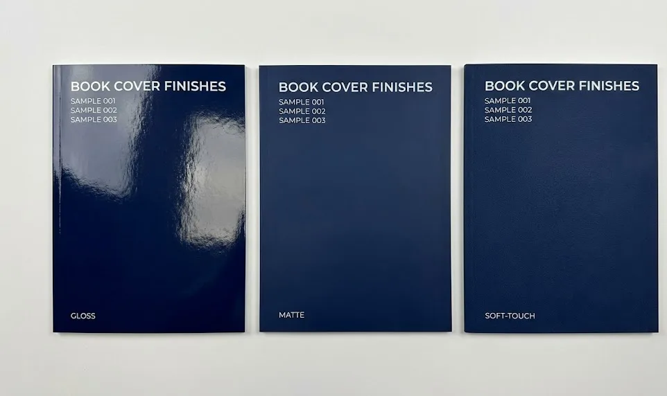
Step 1: The “Master Sample” — Your Only Source of Truth
This is the golden rule, the single most important action you can take to ensure batch-to-batch color consistency:
Stop relying on your digital file. You must provide a “Physical Master Sample” to your printer.
A digital file is only a set of *instructions*, unlike even a digital proof which attempts to predict color (a challenge explained in our guide to sample vs. bulk color differences).
Your first perfect print run is the *result*. That physical book or package is the only thing that has “baked in” all the real-world variables—the exact paper batch, the ink, the press settings, and the dot gain from that specific day.
As printing consultant David Zwang says:
“A digital file is a set of instructions, but the original print is the result… This first-run ‘Master Sample’ must become the physical, contractual standard for all subsequent reprints.”
Your Purchase Order (PO) for the reprint should no longer say, “Print using file V3_Final.pdf.” It must say, “All color must match the physical master sample provided.”
This one-sentence change shifts the entire responsibility and gives your printer a concrete, physical target to hit, not an abstract digital file.
Step 2: How to Create, Store, and Use Your Master Sample
A master sample is useless if it’s damaged or stored incorrectly. Here is the professional SOP:
- Archive Immediately: When you receive your first “perfect” print run, immediately pull 3-5 copies. Sign and date the inside cover.
- Store Correctly: Keep your copies in a dark, dry place (like a file cabinet). Do NOT leave them on a bookshelf exposed to sunlight, as they will fade and become a useless standard.
- Share with Your Printer: Mail one of these perfect copies back to your printer immediately and ask them to archive it as the “Master Sample” for all future reprints. A good partner will gladly do this.
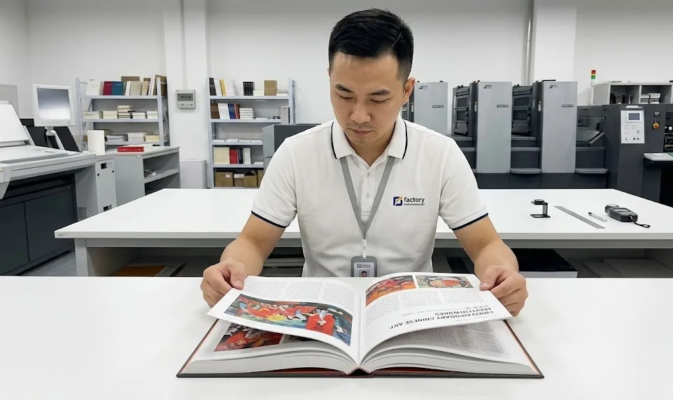
This archived sample becomes your “color contract.” When you place a reorder, the press operator won’t just look at a screen; they will physically hold your master sample next to the new sheet coming off the press to match it.
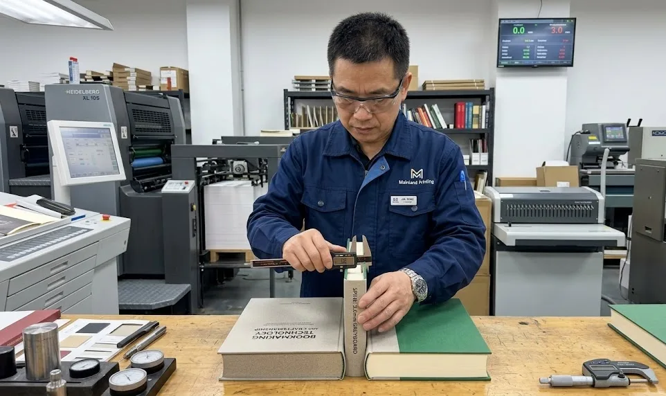
Step 3: When to Use a “Press Check” for a Reprint
A “press check” is when you physically fly to the factory to approve the first printed sheets as they come off the press. It’s the ultimate quality control step, but is it necessary for a reprint?
- If you have a master sample: A press check is usually not needed. Your printer can use the physical sample to match the color, saving you time and money.
- When a press check IS critical: You should still pay for a press check on a reprint in two situations:
- Your brand color is non-negotiable (think Tiffany Blue or Coca-Cola Red).
- You have been forced to change printers, and this is the new printer’s first attempt at matching your old printer’s master sample.
Conclusion:

At the end of the day, color variation between print runs is a physical reality. Paper and ink will always have slight batch-to-batch differences. The critical takeaway is that these variables can, and must, be managed.
The difference between an amateur printer and a true professional partner is how they respond to this challenge.
- An amateur printer will blame the variables. They’ll shrug and say, “It’s the paper batch, it’s out of our control.”
- A professional partner manages the variables. They anticipate them.
We faced this exact challenge with an author publishing a fantasy trilogy. When she ordered a reprint of Book 1 to be released alongside the new Book 2, we found the new paper stock was slightly warmer than her original run.
Simply reprinting the file would have resulted in two books that didn’t match on the shelf—a disaster for a book series.
Instead of blaming the paper, our color experts used the master sample from her first run. We used a spectrophotometer to measure the exact color difference of the new paper. Then, our prepress team digitally adjusted her file—slightly reducing the yellow—to compensate for the warmer paper.
The result? The reprinted Book 1 and the new Book 2 were a perfect visual match to the original. That is color management.
An amateur printer complains about variables. A professional partner actively compensates for them.
Your brand’s consistency on reprints depends entirely on your printer’s quality control process. Stop fighting over why your reprints look different. Partner with an expert who has a system to ensure they don’t.
References & Notes
[1] CIE Whiteness: This is a measurement standard from the International Commission on Illumination (CIE). It quantifies how “white” paper appears to the human eye, factoring in both lightness and shade (e.g., a blue-white vs. a yellow-white).
[2] Dot Gain: A core principle in offset printing where the printed dots of ink spread as they are absorbed by the paper. A 5-8% change in dot gain, often caused by humidity, can significantly darken an image.
[3] Master Sample: In professional printing, this is the final, approved physical copy from the first print run, archived and used as the binding color target for all subsequent reprints, superseding the digital file.