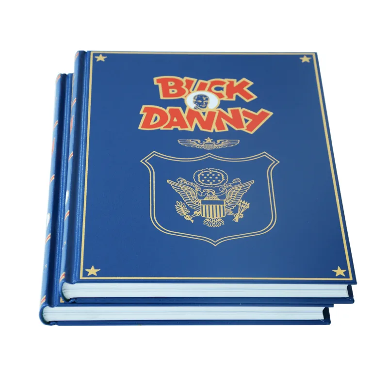
Have you ever approved a Pantone color, confirmed it with your printer, and still received finished books where the leather cover and interior pages look like they belong to two completely different projects? This is not a vendor execution failure — it is a material science problem with a precise engineering solution, and understanding it is the only way to protect your production budget from a full-run reprint.
Leather and coated paper are incompatible color systems: leather requires Pantone FHI references and custom ink formulas tested for adhesion and flexibility, while inner pages use Pantone Graphics calibrated to ISO 12647-2 at ΔE ≤ 2.0 under D50 lighting — measured separately per substrate.
Below, we outline the exact four-stage material-first workflow and the ΔE benchmarks your printer must document before a single sheet goes to press — so your next hybrid project is approved on evidence, not assumption.
Why Your Leather Cover and Inner Pages Never Match (And How to Fix It)

You’ve done everything right on paper. The Pantone number is specified in your file. The printer confirmed they can match it. Then the finished books arrive, and the cover and interior pages look like they came from two completely different projects. This isn’t a mistake — it’s a material science problem that most printers never explain upfront.
The core issue is that leather and coated paper absorb and reflect light in fundamentally different ways. Leather has a porous, organic surface with a topcoat finish that scatters light unpredictably. Coated paper has a smooth, controlled surface engineered specifically for ink adhesion. The same Pantone value printed on both will never look identical — and expecting it to is the wrong starting point.
The Two Systems Pantone Doesn’t Advertise Together
Here’s what changes everything: Pantone actually maintains two separate physical color systems for a reason.
- Pantone for Graphics — designed for coated and uncoated paper substrates
- Pantone FHI System colors — designed for textiles, leather, and plastics
These are not interchangeable. A chip from your Pantone 186 C coated guide uses a completely different ink formula than its closest FHI equivalent. When your printer references only one guide for both materials, color drift is guaranteed.
Professional color matching across hybrid materials requires a ΔE (Delta E) tolerance target of ≤ 2.0 — the threshold at which color difference becomes just perceptible to the human eye under standard D50 lighting. Critically, this measurement must be taken separately on the leather cover and on the printed inner pages, not averaged across both.
The fix isn’t a better Pantone guide. It’s a workflow that treats your leather substrate as the master color reference — and builds everything else around it.
The Material Science Behind the Color Gap
Here’s the core problem that trips up even experienced print buyers: you’re not matching one color across two surfaces. You’re matching one color across two completely different physical systems. And that distinction changes everything about how you approach production.
Coated paper receives ink on its surface. The clay coating seals the fibers, so ink sits on top and reflects light in a predictable, controlled way. That’s why your inner pages are relatively straightforward to calibrate.
Why Leather Behaves Differently
Leather is a living material — even after tanning and finishing. Its natural pore structure, residual oils, and topcoat type (aniline, semi-aniline, or pigmented) all directly affect how a dye or ink bonds and how the final color reads to the eye.
This is why Pantone maintains two entirely separate physical reference systems:
- Pantone for Graphics — calibrated for coated and uncoated paper substrates
- Pantone Fashion, Home + Interiors (FHI) — calibrated for textiles, leather, and soft goods
A Pantone 186 C chip from your graphics guide is not the same formula as its FHI equivalent. Using the wrong reference system is one of the most common — and most expensive — mistakes in hardcover book printing projects.
The Measurement Standard That Matters
Professional color matching is measured in ΔE (Delta E) values under standardized D50 lighting. For critical book work, the industry target is ΔE ≤ 2.0 — the threshold at which a color difference becomes just perceptible to the human eye.
Your leather cover and your printed inner pages each need to hit that target independently. But they need to be evaluated together, under the same light, before production is approved.
A Printer’s Qualification Checklist for Hybrid Projects
Most printers can handle either a leather cover or a printed book interior. Far fewer can manage both — simultaneously, to the same color standard. Before you commit to a supplier, especially when evaluating book printing in China, you need a way to separate the ones who can from the ones who will learn on your project.
These are the questions that matter. A qualified printer will answer them without hesitation.
Questions to Ask Before You Sign Off
- Do you maintain a physical substrate library — actual leather swatches with documented ink formulas and measured ΔE values?
- Can you produce a hand-crafted color sample on my exact leather before any inner pages go to press?
- Do you use a spectrophotometer (such as an X-Rite i1Pro 3) to measure color on both the leather and the press sheets?
- What is your accepted ΔE tolerance for this type of project, and is it documented in the contract?
- Will you provide a fully assembled physical dummy — leather cover bound to printed inner pages — before production approval?
- Do you reference Pantone for Fashion, Home + Interiors for leather, separately from Pantone for Graphics on paper?
If a printer hesitates on any of these, that hesitation is your answer when reviewing your book printing quote details. A supplier who cannot describe their cross-material color workflow in specific terms is almost certainly approving leather color from a digital proof — the exact trap that causes visible mismatches at delivery.
A printer who answers confidently, with documented evidence, is one who has solved this problem before. That track record is what protects your project.
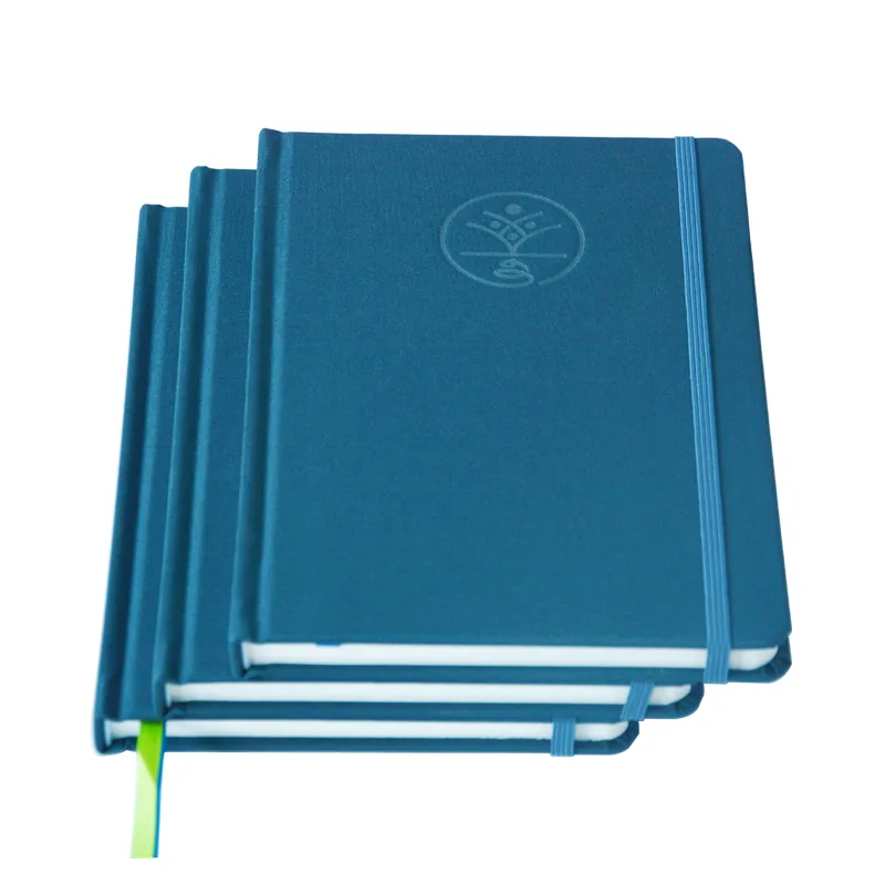
CASE STUDY: From High-Risk to Flawless Finish — Achieving 100% Color Harmony
Discover how we solved the complex color drift between textured leather covers and premium coated paper for a luxury notebook series, ensuring a perfect visual match under any lighting.
The “Material-First” Production Workflow

Here’s where most projects go wrong — and where your budget takes the hit. The conventional approach is to finalize your design, pick a Pantone color, and then ask the printer to “match it” across your leather cover and inner pages. That sequence sounds logical, but it puts color approval on a theoretical reference instead of your actual physical material.
The fix is to flip the entire sequence. Lock your physical substrate first, then build your color system around it.
The Four-Stage Workflow We Use on Every Hybrid Project
- Source and lock the physical leather first. A large swatch from your actual production hide — not a digital image, not a different grain or finish.
- Build a custom ink formula for the leather. Our ink lab mixes and tests adhesion, flexibility, and color fastness against that specific swatch before touching the press.
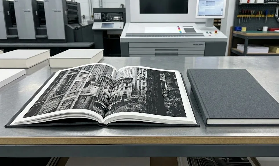
- Calibrate the inner page CMYK profile with the approved leather physically present. The paper color is harmonized to the real leather, not an abstract Pantone chip value.
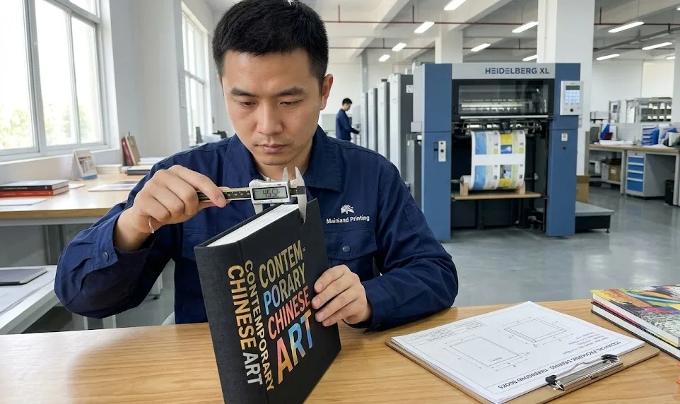
- Validate with a fully assembled physical dummy. Custom-colored leather cover, press-proofed inner pages, bound together and evaluated under standardized D50 lighting.
Why does the D50 lighting condition matter to your final product? Because the same color can look noticeably different under warm showroom lighting versus the daylight your customer sees at home. Professional color approval under D50 eliminates that post-delivery surprise.
This workflow adds one step to pre-production. What it removes is the risk of a full reprint — and the weeks of delay that come with it.
Delta E (ΔE) Visual Impact & Print Industry Standards
| ΔE Value | Visual Perception | Project Impact |
|---|---|---|
| ≤ 1.0 | Imperceptible | Brand-critical standard |
| 1.0 – 2.0 | Just perceptible | ISO 12647-2 acceptable |
| 2.0 – 3.5 | Clearly visible | Risk of mismatch |
| > 3.5 | Obvious mismatch | Reprint required |
Quick Guide: If your priority is brand-critical consistency, demand a target of ≤ 1.0; if you face standard commercial requirements, ISO-compliant ≤ 2.0 is the industry benchmark.
Building a Legacy of Color Consistency

Here’s something that doesn’t get talked about enough: a single reprint order, placed two years after your original run, can expose every weakness in your supplier’s color management system. If your printer didn’t archive the right data the first time, you’re starting from scratch — and your readers will notice.
This is where the difference between a transactional printer and a true production partner becomes tangible. Consistency across years, not just across a single run, is what protects your brand.
What a Long-Term Color Archive Actually Contains
Maintaining color legacy isn’t about saving a PDF. It requires a structured physical and digital record for every project. At Mainland Printing, each completed project file includes:
- The custom ink formula used for the leather cover, documented by pigment ratio and batch reference
- A physical leather swatch from the approved production run, stored under controlled conditions
- Spectrophotometer readings (ΔE values) for both the cover and inner pages, measured under D50 standardized lighting
- The ICC profile and press settings used for the inner page signatures
When your reprint order arrives — whether in 18 months or four years — this archive is the starting point, not a blank slate. Your ΔE tolerance target of ≤ 2.0 is achievable on reprint precisely because the baseline was documented correctly the first time.
Think about what that means for your project long-term. You’re not just buying a print run. You’re building a reproducible production standard that compounds in value every time you go back to press.
Conclusion: Protect Your Brand with Precision
Your book’s visual harmony is a direct reflection of your brand’s commitment to quality. Applying these material-first principles protects that investment from the start.
The technical checkpoints we’ve outlined—from Pantone FHI selection to ΔE validation—secure your product’s quality and your peace of mind. For more on establishing a robust quality foundation, see our guide on quality control in book printing.
Ready to move forward with confidence? Get Your Custom Quote and let’s discuss your project.