Struggling to get your brand colors to match across different book materials? In this guide, I will show you the exact pre-press techniques we use to eliminate visual metamerism and compensate for dot gain, guaranteeing perfect Pantone consistency on your next premium print run.
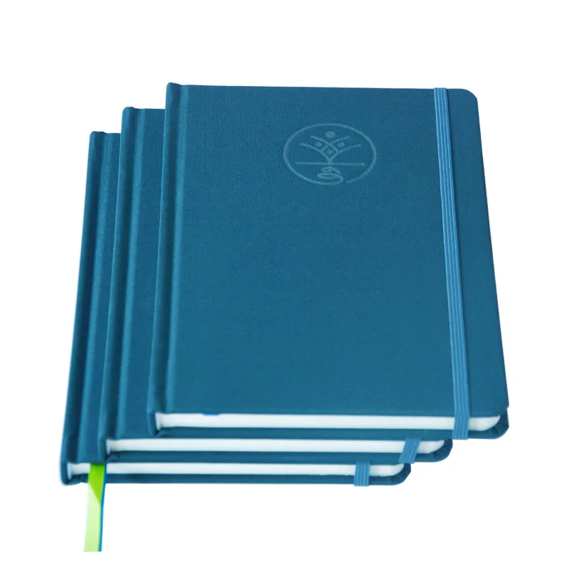
To match Pantone colors across leather and paper, printers use pre-press reverse compensation to reduce mid-tone dot gain by 8-12% on leather files. This digital offset counteracts the leather’s high ink absorption and the thermal color shift that occurs during the heated case binding process.
Want to know how to verify these results before mass production? Keep reading to discover the objective Delta E proofing protocol that will protect your next high-stakes publishing project from costly color disputes.
Why Ink Behaves Differently on Leather vs. Pape

You might assume that specifying a precise Pantone Matching System (PMS) code guarantees color consistency across your entire project. This is a fundamental misunderstanding of commercial offset printing, as the exact same ink formula will perform drastically differently depending on a substrate’s surface tension and spectral reflectance.
Consider the mechanics of light and material. A standard 157gsm coated paper interior page features a smooth surface that facilitates specular reflection, meaning the tonal value increase—commonly known as dot gain—remains stable. However, when you apply that same ink to a textured PU leather cover, the material’s porous micro-fibers generate aggressive capillary action.
The ink spreads, the shadows plug up, and the resulting color appears significantly darker and muddier. This phenomenon is known as visual metamerism. If your current supplier is simply loading the same volume of ink into the press for both the paper and the leather, they are entirely ignoring the physics of dot gain.
“Achieving color consistency is not about simply matching ink recipes, but understanding the physical interaction between light, ink, and the substrate. Different materials possess vastly different spectral reflectance curves. A color formula that achieves a specific standard on paper will inevitably experience a visual color shift when applied to an absorptive, textured surface unless objective spectral measurement data is utilized.” — Ray Cheydleur, Printing and Packaging Portfolio Manager at X-Rite Pantone; Chairman of the US TAG to ISO TC130.
Substrate Physics and Production Parameters
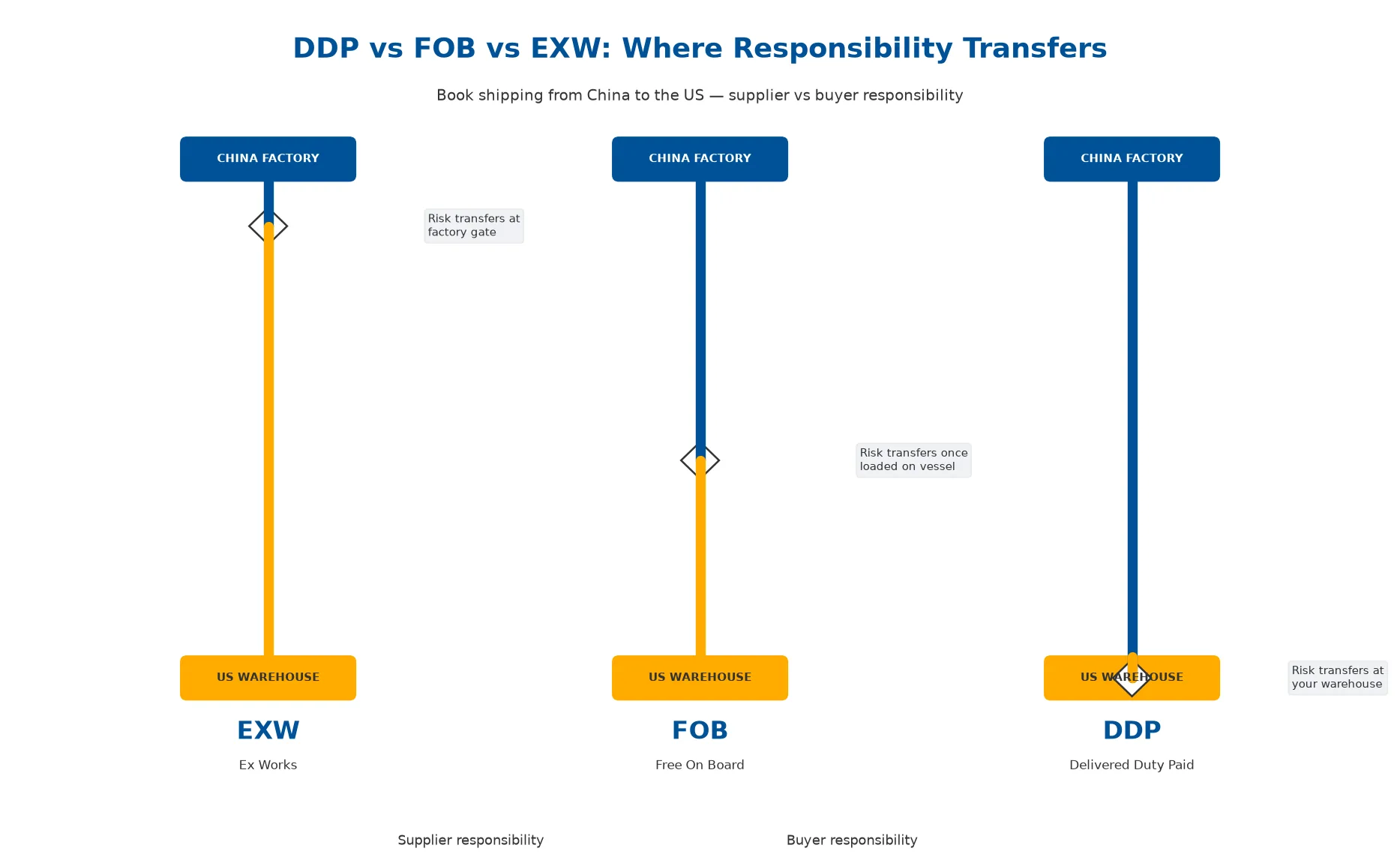
To understand why your covers and inner pages clash, you must look at the mechanical data. Below is a breakdown of how different materials dictate the final visual outcome on the press floor.
Substrate Impact on Dot Gain and Visual Output
| Material Type | Average Dot Gain | Primary Visual Risk |
|---|---|---|
| 157gsm Coated Paper | 12% – 15% | Minimal; provides highly accurate Pantone reproduction. |
| Matte Art Paper | 15% – 18% | Slight desaturation; colors appear softer but predictable. |
| PU Leather / Faux Leather | 22% – 28% | Severe darkening; heavy dot gain causes mid-tones to plug up completely. |
| Genuine Leather | 25% – 30%+ | Unpredictable color shifts; highly susceptible to ambient humidity. |
Quick Guide: If your priority is absolute Pantone accuracy, choose coated paper covers; if you face the necessity of textured PU leather, invest in proactive pre-press reverse compensation.
The Hidden Variable That Destroys Color
Even if the ink density is adjusted perfectly on the press, there is a secondary, highly destructive variable that most standard procurement guidelines fail to address. Many production managers fall into the trap of signing off on a loose press sheet, evaluating an unbound, flat piece of printed PU leather in a light booth.
When the color looks accurate, they authorize mass production, yet when the final hardcover books arrive, the leather covers look washed out or heavily discolored. This happens because you evaluated the material before it was subjected to the thermodynamic violence of case binding.
To bond PU leather to high-density greyboard, PUR hot melt adhesives must be applied at extreme temperatures. This heat, combined with the physical pressure of the casing-in process, triggers a chemical reaction in the leather’s base dyes.
A loose press sheet that measures perfectly on the press floor will inevitably shift by a Delta E of 1.5 to 2.0 after passing through a heated bindery line.
Field Notes: The Loose Sheet Fallacy
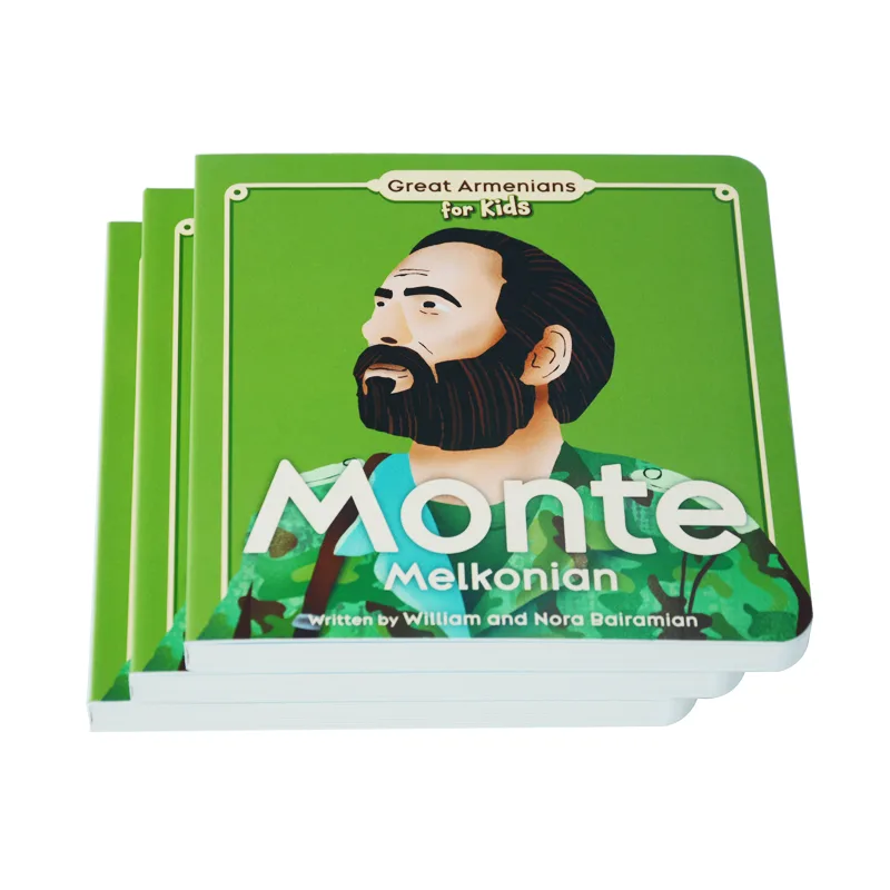
- The Scenario: An independent publisher required their 10th Anniversary Edition to feature an exact PMS 286C deep blue on both a textured PU leather cover and the 157gsm coated interior pages.
- The Trap: Their previous supplier provided flat, unglued press sheets for approval, which looked acceptable under natural light, prompting the client to blindly sign off.
- The Catastrophe: During mass production, the covers went through the case-making machines, where the 150°C hot melt glue and heavy mechanical pressing caused a severe thermal color shift. The ink, already expanding due to the leather’s texture, darkened aggressively under the heat, resulting in muddy, mismatched covers that made the client assume the factory swapped the ink to save money.
- The Reality: The ink was identical, but the supplier simply failed to account for the thermodynamics of the bindery.
Pre-Press Reverse Compensation
How do you counteract these physical and chemical inevitabilities? The answer lies in pre-press reverse compensation, rather than relying on the press operator to chase an impossible target during the run. When managing a mixed-material project, prepress engineers must intervene before the plates are output.
You cannot send the exact same CMYK or Spot Color file to the press for both paper and leather. By implementing advanced pre-press file preparation techniques, we can isolate the variables and adjust the artwork digitally before physical printing begins.
The Pre-Press Workflow for Cross-Substrate Matching
- File Isolation: Separate the cover artwork from the interior artwork, even if they share the exact same vector elements and color codes.
- Reverse Curve Application: Digitally force an 8% to 12% reduction in the mid-tone dot gain specifically for the leather cover files, which creates a digital buffer against the material’s aggressive capillary action.
- Base Tone Calibration: If the PU leather has a yellow or grey undertone, the pre-press file must be adjusted to subtract those specific color values from the ink profile.
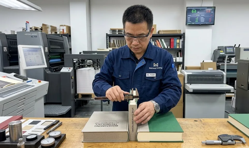
On the production floor, this data-driven strategy must be executed precisely. Operating within a modernized Chinese printing facility equipped with advanced Heidelberg/Komori presses, master press operators must intentionally print the PU leather covers slightly cooler and lighter than the target PMS code. We engineer a deliberate physical mismatch on the press.
By anticipating the extreme heat of the bindery, we allow the thermal process to chemically cure the leather right into the target color tolerance as the book cools and sets. This ensures a flawless high-end book manufacturing process from digital file to final shipment.
“To make a print on a rough material visually match a print on smooth paper, press operators must meticulously manage the tonal value increase and neutral gray balance. Attempting to force the exact same solid ink densities across two wildly different substrates will almost guarantee a visual mismatch.” — Don Hutcheson, Inventor of the G7 methodology; Former Chair of the IDEAlliance Print Properties Working Group.
Ready to Guarantee Flawless Color Matching?
Stop risking your project with inconsistent book covers. Let our pre-press experts handle the technical compensations and objective Delta E tolerances for your mixed-material publishing run.
Objective Validation
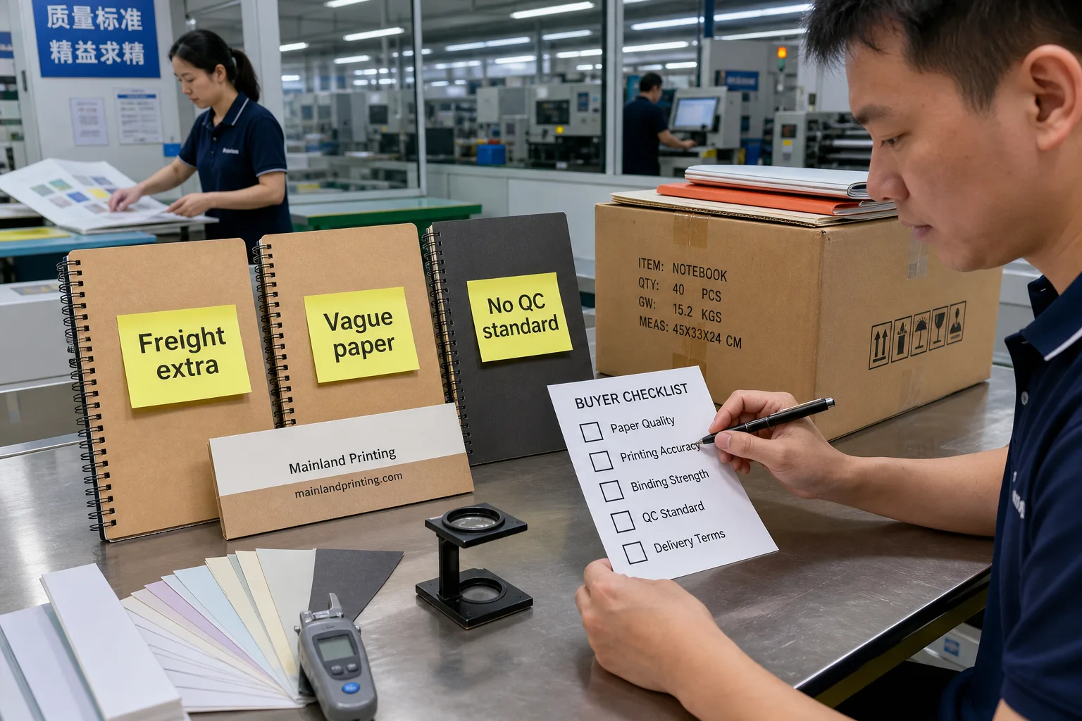
Managing overseas print procurement requires a robust defense against subjective quality disputes. You cannot present a flawed, off-color leather cover to your art director and simply blame the material limitations.
You need an objective framework that eliminates guesswork, establishes clear boundaries, and holds your supplier accountable to objective quality control standards. Stop relying on visual approximations over video calls or poorly lit smartphone photos, as you must establish a non-negotiable proofing approval protocol based on strict Delta E metrics before any purchase order is signed.
Any supplier promising zero color difference across leather and coated paper is lying to you; a Delta E variance of 3.0 is the absolute physical limit for cross-substrate matching.
The Cost of Failure vs. The Cost of Quality Control
Failing to implement objective standards carries severe financial implications. Compare the hidden costs of subjective approval versus the upfront investment in objective quality control.
Subjective vs. Objective Print Procurement
| Phase | Subjective Approval (The Risky Path) | Objective Protocol (The Secure Path) |
|---|---|---|
| Proofing Phase | Free digital PDFs or cheap flat sheets. | Paid, fully bound wet proofs with spectrophotometer reports. |
| Quality Control | Visual checks under random factory lighting. | Standardized ISO 3664 D65 lighting evaluations. |
| Financial Impact | Potential total loss, massive reprint costs, delayed launches. | Secure supply chain, protected profit margins, satisfied buyers. |
Quick Guide: If your priority is a protected profit margin and secure supply chain, choose the objective protocol; if you face tight initial budgets, remember that subjective approval risks total cargo loss.
Your Procurement Checklist
To protect your project and your professional credibility, implement these specific requirements into your next Vendor Service Level Agreement (SLA):
- Define the Delta E Tolerance Ceiling: Acknowledge the physical limits of cross-substrate matching, demanding a Delta E of ≤ 1.5 for paper-to-paper matches, but setting a realistic, hard limit of Delta E ≤ 3.0 for leather-to-paper matches.
- Mandate D65 Lighting Standards: Stipulate that all color evaluations, both in the factory and in your office, must occur under ISO 3664 standard D65 (6500K) lighting, as ambient office lighting will introduce metameric failure and render the evaluation useless.
- Refuse Loose Press Sheets: Never sign off on an unbound piece of cover material, and instead demand a fully bound wet proof that undergoes the exact gluing, heating, and pressing processes as the final mass production run.
- Require Spectrophotometer Reports: When the supplier ships the fully bound proof, mandate that it includes a printed report from a calibrated spectrophotometer detailing the exact Delta E variance between the cover and the interior pages.
When Physics Wins
What happens when you hit the absolute physical ceiling? Occasionally, a brand will select a highly specific, high-luminance Pantone color, such as a fluorescent or a very bright pastel, and demand it be printed on a dark, heavily textured faux leather.
In these extreme cases, even the most advanced Heidelberg press and the most aggressive pre-press compensation cannot defeat the physics of the substrate, meaning the color will fail to meet the Delta E ≤ 3.0 standard. A professional manufacturing partner will not string you along with false hope, but will immediately pivot to high-end contingency plans.
- White Ink Base Layers: Applying a double-hit of opaque white ink via screen printing before applying the offset CMYK/Pantone layer creates an artificial paper-like surface on top of the leather, neutralizing the material’s dark undertone.
- Foil Stamping: Bypassing wet ink entirely by using pigmented foils, which are completely opaque and unaffected by substrate color, applied via heat and pressure to achieve absolute brand color accuracy.
- Material Re-specification: Transitioning from a deep-grain PU leather to a specialized, micro-textured synthetic binding cloth that is specifically engineered for offset color fidelity.
Standardizing Your Print Procurement

Overcoming the physical discrepancies between leather covers and printed inner pages requires intense engineering, precise thermal anticipation, and a deep understanding of material science. After spending over a decade managing high-end book manufacturing and pre-press troubleshooting, the pattern is clear: projects fail because buyers trust subjective visual checks over objective manufacturing protocols.
True color consistency is not an accident; it is the result of rigorous stress tests, meticulous file preparation, and strict adherence to global offset printing standards. Stop guessing with loose press sheets.
Connect with our senior project management team to establish clear Delta E tolerances and secure a fully bound, data-backed proof for your next international publishing project. Establish the standards today, and protect your brand’s integrity tomorrow.