Are you looking for proven interactive features for your board book that go beyond just looking good? This guide provides a strategic framework for product managers to select and implement features that increase commercial value and mitigate production risks. We’ll show you exactly how to choose the right interactive elements to create a bestseller.
The most effective interactive features for a board book are Lift-the-Flaps for creating discovery, Die-Cuts for enhancing shelf appeal, Touch-and-Feel textures for sensory learning, Sliders for demonstrating action, and Pop-ups for creating a premium “wow” moment. The best choice depends on your product’s specific educational or narrative goal and budget.
Now that you know the core features, the next step is to learn which one is the right strategic fit for your project. Read on to get our “Feature-Goal Matrix” that will help you make the smartest, most profitable decision.
The Core Interactive Features

Before you can decide which feature is right for your project, you need a clear understanding of the core options. Think of this as your creative library—each feature has its own unique strengths, ideal use cases, and production considerations.
Engineering Discovery
The simple lift-the-flap is perhaps the most classic interactive feature, and for good reason: it taps directly into a child’s instinct for curiosity. By hiding an image or a piece of text, a flap creates a small moment of suspense and a satisfying reveal.
- Best Application: This mechanism is incredibly versatile. Use it for question-and-answer formats (“What’s behind the door?”), cause-and-effect lessons, or simple peek-a-boo games. Developmentally, it’s a powerful tool. As Dr. Tovah P. Klein of the Barnard College Center for Toddler Development notes, features like this help toddlers physically grasp the concept of “object permanence“—the understanding that things still exist even when they can’t be seen.
Shaping the Narrative
Die-cuts involve cutting paperboard into custom shapes, creating everything from books shaped like fire trucks to intricate windows that offer a glimpse into the next page. This feature fundamentally alters the physical silhouette of your product.
- Best Application: Use die-cuts to create visual layers, allowing readers to peek through a forest canopy to the ground below, for instance. For a product manager, one of the most compelling aspects of die-cuts is their power in a retail setting. Consider a “Shelf Impact Score”: a standard square book might score a 3 out of 10 for visibility, while a book die-cut into the shape of a star immediately grabs a shopper’s attention, scoring a 9. This physical distinction can be a significant advantage in a crowded bookstore.
Making Concepts Tangible
Incorporating different types of binding and textures—a patch of soft faux fur for a bear, a scratchy surface for sand—provides a multi-sensory reading experience. It bridges the gap between a word and its real-world meaning, allowing a child to feel what “fluffy” means.
- Best Application: This is the go-to feature for early concept books focused on animals, nature, or vocabulary building. However, material selection is critical. In one case, a client came to us after their previous supplier used a low-cost glitter application for a “sparkly” magic wand. The glitter shed excessively, leading to a failed safety test and a product recall. By switching to a sealed glitter fabric, we delivered the desired effect while ensuring the product was safe and durable. The lesson is clear: for any component a child will touch, safety and quality are non-negotiable.
Putting the Story in Motion
Sliders and pull-tabs are mechanisms that allow a child to physically move an element across the page. This feature is perfect for demonstrating action, transformation, and processes.
- Best Application: Show a caterpillar changing into a butterfly, a car driving down a road, or a character’s facial expression changing. But the design must be user-centric. We once worked on a beautiful design for a rocket launch book where the pull-tab was a delicate flame. It looked fantastic, but in prototyping, we found it was too small for a child’s fingers to grip and pull effectively. The design had to be reworked to be more robust. Always ask: can a three-year-old operate this easily and intuitively?
Creating the “Wow” Moment
Pop-ups are the most complex and visually impressive interactive feature, creating three-dimensional scenes that literally leap off the page. They deliver an unparalleled moment of surprise and delight.
- Best Application: Due to their complexity and cost, pop-ups are best reserved for flagship products, special editions, or the climactic moment of a story. The key is to ensure the spectacle serves the narrative.
As renowned paper engineer Robert Sabuda often emphasizes, the “wow” factor of a pop-up is most powerful when it reveals something crucial to the story, rather than just being a gimmick.
Making the Smartest Choice
With a library of creative options, the next question becomes strategic: which feature is the right investment for your specific product?
A feature that’s brilliant for a narrative-driven storybook could be a poor fit for an early-learning concept book. To move past guesswork, you can use a simple decision-making tool: the Feature-Goal Matrix.
This framework helps you map interactive features against two critical project variables: your primary goal and your acceptable level of production complexity and cost.
The Matrix Explained
- The Horizontal Axis: Primary Goal. Is your book primarily Education-Oriented, designed to teach concepts like colors, numbers, or vocabulary? Or is it Narrative-Oriented, focused on telling a story and creating an emotional connection?
- The Vertical Axis: Production Complexity & Cost. This ranges from Low (simpler die-cuts, minimal handwork) to High (complex pop-ups, multi-part sliders).
| Complexity | Education-Oriented | Narrative-Oriented |
|---|---|---|
| High Complexity | Sliders/Pull-tabs: Perfect for demonstrating processes (e.g., life cycles). | Complex Pop-ups: Delivers the ultimate story climax or a high-value gift experience. |
| Low Complexity | Touch-and-Feel: Directly links words to sensory experiences. | Lift-the-Flaps: Builds suspense and reveals story surprises. A versatile choice. |
| Die-Cuts: Can be used for both simple concept association and creating layered scenes. |
How to Use This Tool
This matrix isn’t just a chart; it’s a tool to build a business case. Instead of saying “I think a pop-up would be cool,” you can now say, “Because our goal is to create a premium, narrative-driven gift book, a complex pop-up aligns with our strategy, even at a higher cost to print a board book.”
To pinpoint the best path for your project, ask yourself these three questions:
- What is the single most important thing I want this book to achieve for the child? (This defines your horizontal axis.)
- What is the commercial positioning of this product? (Is it a mass-market, budget-friendly item or a premium, high-margin product? This defines your vertical axis.)
- Which feature sits at the intersection of those two answers?
By starting with strategy, you ensure your creative choices are not just exciting, but also commercially sound.
Ready to Bring Your Interactive Book to Life?
From durable materials to complex assembly, our team specializes in high-quality board book printing. Let’s discuss how to turn your interactive vision into a stunning, child-safe product.
Averting Pitfalls from Design to Production
A brilliant concept on a screen and a successful, durable product on a shelf are two very different things. The gap between them is where costly mistakes happen.
To bridge this divide, you need to bring manufacturing logic into the design process early. Think of the following points as a “Production Feasibility Memo”—a set of golden rules you can share with your design team to prevent major headaches down the line.
A Memo to Your Design Team
Safety is Non-Negotiable.
Every interactive element must pass rigorous child safety standards, like the ASTM F963 small parts test. This means any component that could detach must be large enough not to be a choking hazard. This isn’t a suggestion; it’s a legal requirement that should influence the size and attachment method of every flap, tab, and textured piece from the very first sketch.
Design for a ±2mm World.
Paper and board are physical materials. They shift slightly during printing, cutting, and assembly. This is called “tolerance.” A design that requires a slider to align perfectly with a tiny window to within a millimeter might look great in a digital file, but it’s a recipe for a high failure rate in mass production.
Great design anticipates this by building in a small amount of “forgiveness,” ensuring the mechanism works smoothly every time.
Respect the Materials.
Every material has its own properties. A beautiful matte lamination might be prone to cracking at the spine after repeated use. Certain fuzzy materials might shed fibers. We must ask questions like: How will this adhesive interact with this ink over time? Can this textured fabric withstand a pull test?
Understanding these properties prevents you from choosing a material combination that fails in the hands of a child.
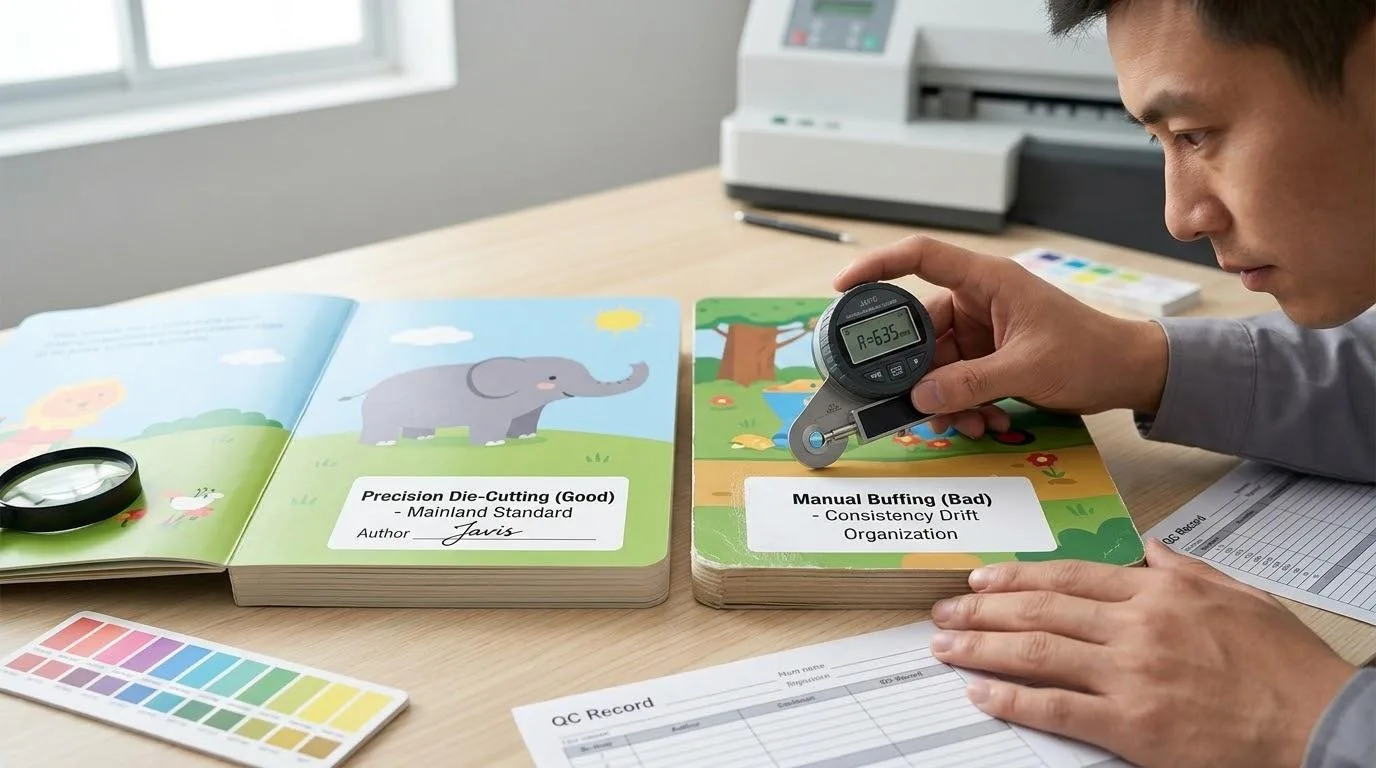
The “White Sample” is the Only Truth.
Before you approve a final design, you must have a physical, unprinted prototype (a “white sample” or “dummy”) in your hands. This is the only way to truly test the user experience.
Is the pull-tab intuitive? Is the flap easy to lift? Does the pop-up deploy without tearing? As we learned from the case of the elegant-but-unusable rocket ship pull-tab, a physical test can reveal fatal usability flaws that are invisible on a screen.
Understand the Hidden Costs of Hand Assembly.
The cost of complex books is driven by manual labor. But not all handwork is equal. The biggest cost driver is the number of “pick-and-place” actions a worker has to perform. A single page with ten small, separate flaps can be significantly more expensive to produce than a page with one large, intricate pop-up, because it requires ten times the manual actions.
When reviewing a design, always ask: “Can we combine these three small pieces into one larger, cleverly die-cut piece?” Reducing the number of individual components is the fastest way to engineer cost out of a project without sacrificing the core interactive experience.
Finding a True Manufacturing Partner

Once your design is locked and you are ready to move into production, the focus shifts to selecting a supplier. It’s tempting to see this as a simple exercise in comparing price quotes, but for complex interactive books, this approach is shortsighted.
You are not just buying printing; you are sourcing a complex, multi-stage manufacturing service. Therefore, you don’t need a printer; you need a manufacturing partner who can manage that complexity alongside you.
Demystifying the Production Journey
A reliable partner will not be a “black box.” They will provide full transparency into the production process, which typically involves these seven key milestones. Understanding them allows you to ask the right questions and manage your project timeline effectively.
- Structural Assessment & Quote: The partner evaluates your design for feasibility and provides a detailed cost breakdown.
- White Sample Approval: You receive and approve a physical, unprinted prototype.
- Pre-press & Color Proofing: Digital proofs are approved to ensure color accuracy.
- Printing & Finishing: The book components are printed and any special finishes (like lamination) are applied.
- Die-cutting & Hand Assembly: The interactive parts are cut and assembled by skilled workers. This is where Quality Control in Book Printing is most critical.
- Final Quality Inspection: The finished products are inspected based on a clear standard (like AQL).
- Safety Testing & Logistics: Final products are sent to a third-party lab for certification before being shipped.
Your Supplier Evaluation Checklist
When you interview potential partners, go beyond the price. Use these questions to gauge their true capability:
- Experience Check: “Can you share a case study of a book you produced with similar complexity to our design?”
- Process Check: “What is your quality control process specifically for the hand-assembly stage?”
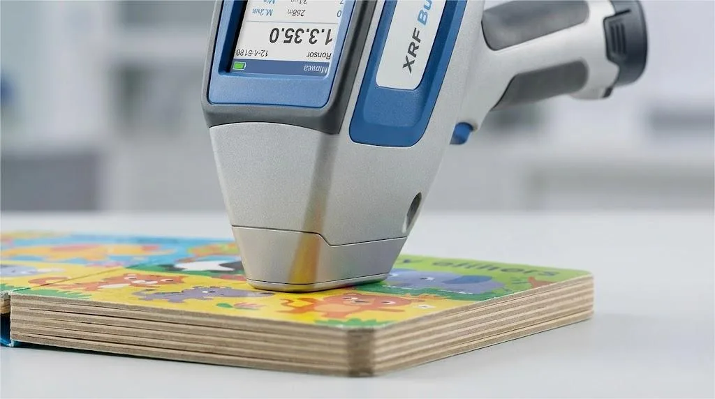
- Compliance Check: “Can you provide your factory’s social compliance audits (like ICTI or BSCI) and recent material safety test reports?”
- Communication Check: “Will we have a dedicated project manager, and what is your standard communication cadence for project updates?”
Finally, a quick note on supply chain strategy. While diversifying manufacturing with a “China+1” approach is a hot topic, it’s often not practical for complex interactive books. The production of these books relies on a dense ecosystem of specialized printers, die-cutters, and skilled assembly teams that has developed over decades in specific regions of China.
Attempting to replicate this elsewhere often leads to higher total costs and significant quality control risks, as critical components still need to be sourced from this ecosystem. The smarter risk-mitigation strategy is often to partner with two vetted, top-tier manufacturers within that established production hub.
Your Next Move from Great Concept to Successful Product

You now have more than just a list of creative ideas. You possess a strategic map to guide your next interactive board book project. We’ve explored the core interactive features for your board book, established a framework for choosing the right one for your goals, navigated the critical design principles that prevent costly production errors, and outlined how to find a manufacturing partner who can truly bring your vision to life.
The journey from a brilliant concept to a beloved, commercially successful product is complex, but it is not a mystery. By arming yourself with this knowledge, you are no longer just reacting to trends; you are strategically engineering success.
References & Notes
[1] Object Permanence: A foundational concept in developmental psychology, first studied in detail by Jean Piaget, referring to a child’s understanding that objects continue to exist even when they cannot be seen or heard.
[2] ASTM F963: The mandatory Standard Consumer Safety Specification for Toy Safety in the United States, enforced by the Consumer Product Safety Commission (CPSC). It includes specific tests for hazards like small parts, sharp edges, and chemical content.