Choosing the wrong softcover interior paper can make your annual report look cheap and unprofessional. This guide gives you the exact framework to select the right paper weight, finish, and opacity, ensuring your project looks premium and avoids costly printing errors.
Choosing the best softcover interior paper depends on your content. For text-heavy reports or manuals, use an uncoated paper (90-105gsm) for optimal readability. For image-heavy annual reports or catalogs with charts, a coated paper (matte or silk, 120-140gsm) is essential for color vibrancy and to prevent ink show-through.
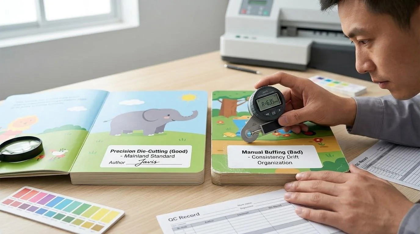
Now that you know the basics, dive in. We’ll share the “Total Cost” secret that most printers won’t tell you and provide a selection matrix you can use today.
Project Type Determines Paper Choice: Text-Heavy or Chart-Heavy?

Your first decision is the most important one, and it simplifies everything that follows. Is your softcover project a text-heavy document, or is it driven by visuals like charts, graphs, and photography?
For Text-Heavy Projects: Uncoated Paper
If you’re creating training manuals, detailed text reports, or legal documents, uncoated paper is your best choice.
The primary benefit is reading comfort. Uncoated stock doesn’t reflect light, reducing glare and eye strain over long reading sessions. It also has a natural, tactile feel that many brands are revisiting.
We’ve noticed a trend away from the idea that all corporate material must be glossy; high-quality uncoated paper can convey a sense of authenticity and sustainable, “human” quality.
However, printing on uncoated paper requires a specific technical setup. We’ve seen clients (and even other printers) fall into a trap we call the “Dull Color Mystery.” A client chose a beautiful, expensive uncoated stock for their brand book. But the final product’s colors looked flat, gray, and lifeless compared to the PDF proof.
The error wasn’t the press or the paper. It was the design file. Uncoated paper is porous and absorbs ink, which can dull colors.
To prevent this, your designer must use an “Uncoated CMYK Profile” during the design process. This profile compensates for the ink absorption from the start, ensuring your brand colors print with the vibrancy you expect.
For Chart- and Image-Heavy Projects: Coated Paper
Are you printing an annual financial report, a product catalog, or a critical sales proposal? You need coated paper.
Coated paper has a surface layer that prevents ink from being absorbed.
As Daniel Dejan, a print and paper expert from Sappi North America, explains, “Uncoated paper is like a sponge… But for corporate reports with sharp data, charts, and photography, coated paper is essential. It provides ‘ink holdout’—the ink sits on top of the coating. This gives you the snap, the color vibrancy, and the detail integrity that professional data visualization demands.”
This “ink holdout” is what ensures your data charts are sharp, your numbers are crisp, and your product photos are vivid.
Within coated papers, you have two main choices:
- Matte / Silk: This is the standard for over 90% of professional corporate reports. It offers excellent color reproduction and sharpness without the high-shine glare of gloss. It looks and feels premium.
- Gloss: This finish provides the highest color saturation and “pop.” It’s excellent for promotional product catalogs where the goal is to grab attention, but it can be reflective and difficult to read under office lighting, making it less ideal for data-heavy reports.
Decoding Paper Specs (GSM, Opacity, Brightness)

The technical specifications on a quote sheet can be intimidating. But understanding these three key terms is the single best way to prevent printing problems, protect your budget, and ensure a professional result.
A. GSM vs. Basis Weight (lb): A Common Trap
You will see paper weight listed in two ways: Grams per Square Meter (gsm) or Basis Weight (lb). GSM is the global standard, while “lb” is common in the US. This is where many procurement errors happen.
Here is the critical insight: The “lb” measurement is relative to a paper’s category. This means an “80 lb Text” paper (for interiors) is completely different—much thinner—than an “80 lb Cover” paper.
If you simply request “80 lb paper,” you are leaving a critical specification open to chance.
To be safe, use this approximate conversion for “Text Stock,” which is the correct category for softcover interiors:
- 60 lb Text $\approx$ 90 gsm (A good starting point for text-only manuals)
- 70 lb Text $\approx$ 105 gsm (A common, high-quality standard for reports)
- 80 lb Text $\approx$ 120 gsm (A premium, sturdy choice for catalogs and reports)
B. Opacity: The True Measure of Quality
Let’s be perfectly clear on this point, as it’s the most important technical lesson in this guide: Paper weight (GSM) does not equal Opacity.
Opacity, measured from 0-100%, is what prevents the ink from one side of the page from being visible on the other. Remember that “show-through disaster” we opened with?
That report was printed on 100gsm paper, which sounds perfectly thick. The problem was that it had low opacity.
For any professional, double-sided color report, this is your safety net: Demand an Opacity rating of 95% or higher. A 105gsm paper with 96% opacity will look and feel far more professional than a heavier 120gsm paper with only 92% opacity.
C. Brightness: A Strategic Trade-Off
Paper brightness (also on a 0-100 scale) is not about “good” or “bad”—it’s about intent.
- For Data-Heavy Reports: A 96-98 Brightness paper creates high contrast. This makes data visualizations, charts, and graphs look exceptionally crisp and sharp.
- For Text-Heavy Manuals: That same high brightness can cause significant eye fatigue during long reading sessions. For a training manual, a standard 92 Brightness or a softer “Natural White” is a more comfortable and effective choice.
Corporate Softcover Paper Selection Matrix
We have covered the core concepts. Now, let’s put it all together. This matrix is your “final answer”—a clear, scannable tool designed to help you make a confident decision. You can screenshot this, send it to your team, or use it to build your print quote request.
Here is our recommended paper selection based on the most common corporate projects:
| Project Type | Recommended Paper | Recommended Specs (Weight / Opacity) | Why? (Solves This Pain Point) |
|---|---|---|---|
| Annual Financial Report | Matte or Silk Coated | 120-140 gsm (80-95 lb Text) / 96%+ Opacity | Professional & Clear. Ensures financial charts are sharp, data is crisp, and there is zero “show-through” to distract stakeholders. |
| Product Catalog | Gloss or Silk Coated | 120-157 gsm (80-100 lb Text) | Maximum “Pop”. Delivers the highest color saturation and vibrancy to make your product images look their best. |
| Training Manual | Premium Uncoated | 90-105 gsm (60-70 lb Text) | Reading Comfort. No glare and a tactile feel, making it ideal for long-form reading and employee note-taking. |
| Corporate White Paper | Matte Coated | 105-120 gsm (70-80 lb Text) / 95%+ Opacity | The Perfect Balance. Clearly reproduces charts and graphs while remaining comfortable for reading text-heavy sections. |
How Paper Choice Impacts Your Total Cost (Not Just Unit Price)
As a responsible manager or procurement specialist, you are trained to look beyond the “per-unit price” when evaluating a print quote. True professional purchasing focuses on the Total Cost of Ownership (TCO).
When it comes to paper, a marketing colleague might instinctively push for “thicker is better”—perhaps choosing a 157gsm paper to give the brand “weight.”
However, a significant budget variable is hidden within this decision, one we call the “invisible killer of logistics costs.”
Let’s do some simple math.
Assume you are printing 5,000 copies of a 200-page report. If you upgrade the interior paper from 120gsm (which is already a premium, professional grade) to 157gsm, the paper weight increases by approximately 30%.
This means:
- Your total freight weight will increase by 30%.
- This will directly cause your “first-level shipping” costs to spike. Whether those reports are moving from a local factory to your office or being shipped internationally, the freight charges will increase proportionally.
- “Secondary distribution” costs can spiral. If you are a public company mailing these annual reports to shareholders worldwide, or if your market team is distributing manuals to various trade shows, every single courier fee will be more expensive because of that 30% weight increase. This part of the budget is very easy to overlook during initial planning.
What is our solution?
We don’t upsell you on the “most expensive” or “thickest” paper. We help you balance “brand feel” with “Total Cost of Ownership.”
In most cases, selecting a 120gsm matte-coated paper with a high opacity (96%+) is the “TCO-optimal solution.”
It 100% eliminates show-through, satisfying all of marketing’s requirements for a professional feel, while also helping you keep your logistics budget within reasonable limits. This prevents that “hidden budget” disaster later on. That is the definition of professional, strategic procurement.
Your Final Check: A Pre-Print Risk Assessment

You have now moved beyond seeing paper as a simple commodity. You see it as a strategic tool—a physical representation of your brand.
But before you sign off on the order, you need to be aware of a few production traps. These are small, technical details that can be easily overlooked but can cause significant delays or quality issues.
For example, your paper choice directly impacts the production schedule. Coated papers, because the ink sits on the surface, require more drying time than uncoated papers. If this isn’t factored in, the ink can smudge or “offset” onto other pages.
Similarly, if you’ve chosen a heavy paper (like 157 gsm) for your interior, it must be “scored” (creased) before folding to prevent the fibers from cracking at the spine.
These are the kinds of details that are built into our process, but not every printer manages them proactively.
Your Solution: A Complimentary “Print Risk” Evaluation
This is why we offer a different kind of call to action. We don’t just want you to “Get a Quote.” We want you to get a solution that works.
Have you selected the correct CMYK color profile for your paper choice? Are your design files properly set up to compensate for ink absorption on uncoated stock? Does your binding choice present a risk of cracking with your chosen paper weight?
Send us your design files for a complimentary “Print Risk Assessment.”
Before we even talk pricing, our experts will review your files and your project goals. We will check your technical setup against your paper choice to ensure they are a perfect match.
This simple, free check is the best way to prevent a costly problem and ensure your softcover interior paper selection results in a final product that truly represents your brand’s quality.
References & Notes
[1] Daniel Dejan (Sappi): Mr. Dejan was a highly respected print and paper evangelist for Sappi North America, a leading global producer of coated papers. His work focused on educating designers and brands on the technical capabilities of paper and print.
[2] Basis Weight vs. GSM: The U.S. “Basis Weight” system measures the weight of 500 sheets of paper in its uncut “parent size,” which varies by paper type (e.g., “Text” size is 25″x38″, “Cover” size is 20″x26″). “GSM” (Grams per Square Meter) is a global standard that measures the weight of a single 1×1 meter sheet, making it a consistent metric across all paper types.
[3] Total Cost of Ownership (TCO): A procurement and financial analysis principle used to assess the *entire* lifecycle cost of a purchase, not just the initial price. For printing, this includes the unit price plus the often-overlooked costs of freight, shipping, warehousing, and customs.