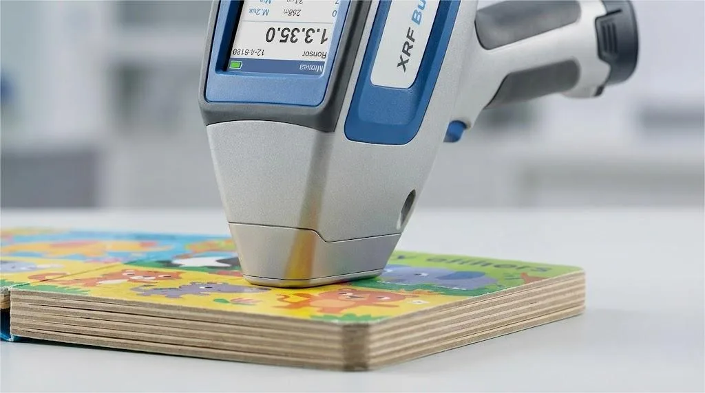
Avoid costly reprints and production delays on your next board book project. This in-depth guide provides the exact technical specifications and professional workflow you need to prepare flawless, print-ready artwork the right way, the first time.
To prepare artwork for board book printing, start with your printer’s specific template. Set a 0.125” bleed and a minimum 0.25” safety margin, ensure all images are 300 DPI in CMYK color mode, and convert all text to outlines before exporting a final, print-ready PDF file.
Now that you have the core steps, dive into our expert techniques for mastering complex spines, spreads, and die-lines to ensure a perfect final product.
Part 1: Your Blueprint for a Flawless File Setup

Every successful print project begins with a meticulously constructed digital foundation. Rushing this initial stage is like building a house on uneven ground—the structural problems will inevitably appear later, causing significant and costly issues.
The single most effective way to guarantee a smooth process is to obtain a custom template directly from your printer before you begin the design layout.
A professional-grade template is more than just a blank page with guides. It should be a layered document (for Adobe Illustrator or InDesign) that includes:
- A Die-line Layer: This shows the exact trim size, rounded corners, and any custom shapes.
- A Bleed Layer: Clearly marking the 0.125-inch zone your artwork must extend to.
- A Safety Margin Layer: A visual guide showing the “safe zone” for all critical content.
- An Annotation Layer: Notes from the printer explaining specific requirements.
Receiving a clean, well-organized template is also your first clue that you’re working with a competent and detail-oriented printing partner.
With your printer’s template open, you can focus on the three pillars of file setup: bleed, safety margin, and image specifications.
Understanding Bleed: Your Essential Buffer Zone
The requirement for a 0.125-inch (3.175 mm) bleed is universal in printing, but why is it so important? During production, your book’s pages are printed on large parent sheets, often alongside other projects (a process called gang-run printing).
These sheets are then trimmed down to size in large stacks. Despite precise machinery, a tiny amount of shifting, known as trim variance, can occur. The bleed is your buffer zone. By extending your background colors and images into this area, you ensure that even with a minuscule shift during trimming, there will never be an accidental sliver of unprinted white paper at the edge of your pages.
The Safety Margin: Protecting Your Content
Just as the bleed protects the edges, the safety margin protects the core of your design. Keeping all essential elements—like text, page numbers, and key parts of an illustration—at least 0.25 inches (6.35 mm) inside the final trim line is crucial.
For board books with their signature rounded corners, this becomes even more important. The gentle curve of the corner means the “safe” area isn’t a perfect rectangle. A generous margin ensures that no part of your design feels awkwardly cramped or gets clipped by the curve.
Image Specifications: Color and Clarity
Finally, let’s address the two most common sources of image-related print errors: resolution and color mode.
- Resolution (DPI): All images intended for print must be 300 DPI (Dots Per Inch). It’s easy to confuse this with PPI (Pixels Per Inch), which measures screen resolution. A 72 PPI image might look sharp on a monitor, but in print, it will appear fuzzy and pixelated. 300 DPI ensures that the density of ink dots is high enough to create sharp, clear, and professional-quality images.
- Color Mode (CMYK): Your screen displays colors using the RGB (Red, Green, Blue) model, which is additive and light-based. Printing presses use the CMYK (Cyan, Magenta, Yellow, Black) model, which is subtractive and ink-based.The range of colors, or gamut, that can be produced with CMYK ink is smaller than the RGB gamut. This means that some vibrant, glowing colors on your screen—like electric blues, deep fuchsias, or neon greens—cannot be perfectly replicated on paper. Converting your files to the Coated GRACoL 2006 CMYK profile before submission allows you to see a more accurate preview of the final printed colors and make any necessary adjustments.
Part 2: Spines, Spreads, and Custom Die-Cuts
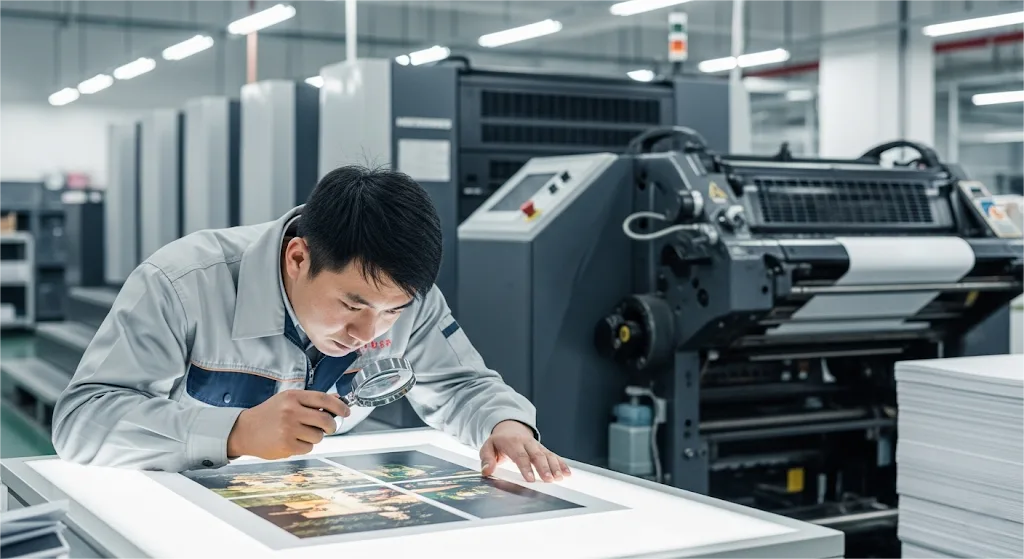
Once your foundational file is correctly set up, it’s time to address the unique physical characteristics—from page thickness to child safety compliance—that define a board book. The thickness of the pages, or caliper, fundamentally changes how you must approach the design of the spine, interior spreads, and any custom-shaped edges.
Calculating and Designing for the Spine
The spine is more than just the book’s backbone; it’s a critical design element that requires mathematical precision. Because board book pages are mounted as individual spreads, the spine’s width is the sum of their total thickness. You can get a close estimate with this formula:
Spine Width Estimate = (Total Number of Pages / 2) x Board Caliper + (Cover Board Caliper x 2)
So, for a 16-page book using a 2mm caliper board, your estimated spine width would be (16/2) x 2mm + (2mm x 2), which equals 20mm.
However, this is only an estimate. During the binding process, a factor known as board compression comes into play, where the pressure of the binding slightly compacts the materials. This is why you must always get the final, confirmed spine width from your printer before finalizing your cover artwork.
As a pro-tip, when designing the wrap-around cover, always extend the background color or texture at least 0.125 inches past the fold lines onto the front and back cover areas. This creates a small buffer to ensure a clean fold with no white lines showing.
Navigating Interior Spreads
Designing a two-page spread in a board book requires a different mindset than designing for a thin paper book. Think of the spread not as a single folded sheet, but as two separate tiles laid side-by-side. There will always be a visible seam or “gutter” down the middle.
While lamination and binding can minimize this, it’s a physical reality that can disrupt your artwork if not handled carefully.
To ensure a clean, professional look:
- Avoid placing small, critical elements directly across the center. This includes faces, logos, or important words in a sentence.
- Do design art that flows across the page, like landscapes or background patterns, ensuring that the most vital subjects are positioned firmly on either the left or right page.
The Critical Importance of a Printer-Supplied Die-Line
This brings us to the most crucial element for any board book with non-rectangular shapes: the die-line. For rounded corners or custom shapes, using a generic template downloaded from the internet is one of the most significant risks you can take.
We once worked with a publisher on a beautifully designed book shaped like a sleeping fox. The designer, working diligently from a generic template, placed the fox’s ear right up against the template’s trim line. When we reviewed the file, we knew it was a potential disaster.
Our cutting equipment has a tiny, industry-standard variance of up to 0.5mm. In this case, that half-millimeter shift meant the fox’s ear could be partially trimmed off, ruining the entire print run. The project was immediately paused while the designer painstakingly adjusted every page to fit our custom, machine-specific die-line.
This real-world example underscores the advice from bestselling children’s book author and illustrator, Debbie Ridpath Ohi:
“The first step with any book project is to get the printer’s exact template. Don’t guess or use a generic one.”
– Debbie Ridpath Ohi, Bestselling Author & Illustrator
Technically, a die-line is a vector path that guides the creation of the physical steel rule die that will cut your books. In your design file (e.g., Adobe Illustrator), it should be:
- Placed on its own separate, locked layer named “Dieline.”
- Set to a unique, highly visible spot color (like 100% Magenta).
- Configured to “overprint” in the attributes panel so it doesn’t knock out the artwork underneath it during proofing.
Your printer’s die-line is the definitive blueprint. Treat it as the single source of truth for your layout.
Ready to Print Your Board Book?
Our specialists handle the complexities of board book printing, from custom die-lines to safety compliance, ensuring a beautiful and durable final product.
Part 3: Your Final Quality Control Checklist
Once your design is complete, the spreads are perfect, and you’ve used the printer’s official die-line. Now, you’ve arrived at the final, critical stage before handoff: the pre-flight check. This is your last opportunity to catch any technical issues and ensure the file you submit is a perfect representation of your creative vision.
Think of it as a pilot’s final check before takeoff—a systematic review that guarantees a smooth journey.
This step is crucial because the integrity of the submitted file is ultimately your responsibility. As print industry consultant John Zarwan clearly states:
“The printer’s job is to reproduce what’s in your file, not to fix it.”
– John Zarwan, Print Industry Consultant
A flawless file is your best insurance for a flawless print run. Before you export, meticulously review the following points.
1. Convert All Text to Outlines
What it is: This technical step in your design software (e.g., Adobe Illustrator’s “Create Outlines” command) converts text from editable font data into static vector shapes.
Why it’s critical: If you submit a file with live text, and the printer’s system doesn’t have the exact same font file installed, the system will automatically substitute it with a default font. Your carefully chosen, expressive typography could be replaced with a generic font like Arial or Times New Roman, completely altering the mood and professionalism of your book. Converting to outlines ensures your text will look exactly as you designed it, no matter who opens the file.
2. Embed All Linked Images
What it is: Your design document often “links” to external image files (like TIFFs or PSDs) to keep the file size manageable during the design phase. Embedding pulls a full-resolution copy of that image directly into your final print file.
Why it’s critical: Submitting a file with linked images is like sending a letter and forgetting to put the photos in the envelope. The printer won’t have access to the linked files on your local computer, resulting in missing images, low-resolution placeholders being printed, and an immediate halt to your project.
3. Clean and Organize Your Layers
What it is: Before exporting, take a moment to delete any unused layers, hidden guides, rough sketches, or designer notes. Name your final layers clearly and logically (e.g., “Artwork,” “Dieline,” “Spot Varnish”).
Why it’s critical: A clean file is a sign of a professional. It allows the printer’s pre-press department to quickly identify the necessary elements, reducing the chance of misinterpreting your intent and speeding up the entire verification process.
4. Export to the Correct PDF Format
What it is: For the final export, avoid generic settings like “Smallest File Size” or “High Quality Print.” Instead, use a dedicated pre-press standard.
Why it’s critical: The PDF/X-1a preset is the industry-standard for graphic content exchange. It is specifically designed to create a “sealed container” for your artwork by enforcing print-ready requirements. This preset automatically flattens transparency, ensures all fonts are embedded (or outlined), and standardizes color information, preventing a host of the most common printing errors.
Quick Reference: Common File Preparation Errors
| The Error | Why It Happens | The Solution |
|---|---|---|
| Insufficient Bleed | Misunderstanding trim variance | Set 0.125″ bleed on all sides |
| Low-Resolution (72 DPI) Images | Using web images for print | Ensure all images are 300 DPI |
| File in RGB Color Mode | Designing for screen, not ink | Convert all to CMYK (GRACoL 2006) |
| Using a Generic Template | Fails to match printer’s machinery | Use printer-supplied die-line ONLY |
| Live Fonts in Final PDF | Risk of font substitution | Convert all text to outlines |
Part 4: Transforming a Process into a Partnership
By this point, you have mastered the technical requirements for creating a flawless, print-ready file. However, the most successful projects are built on more than just perfect files; they are built on strong, collaborative partnerships. The entire process of preparing your artwork should also serve as a valuable tool for evaluating and strengthening the relationship with your printing partner.
Your professionalism and attention to detail signal to the printer that you are a serious partner, and you should expect the same in return. The initial technical exchange is your opportunity to vet a potential supplier. A printer who responds promptly with custom templates, clear specifications, and proactive advice is demonstrating their commitment to your project’s success.
To help you gauge this, use your initial contact to ask specific, qualifying questions. This isn’t about being difficult; it’s about initiating a professional dialogue that clarifies expectations for both sides.
A Quick Vetting Guide: Key Questions for Your Printer
- “Can you please provide a custom die-line template for our project? It is a [page count]-page, [dimensions] board book using [X]mm board.”
- A strong partner will respond promptly with a properly layered vector file tailored to your exact specifications.
- A red flag is a response directing you to a generic template or asking you to build it yourself based on written specs.
- “What is your preferred PDF export preset and CMYK color profile for your presses?”
- A strong partner will give you a clear, specific answer, such as “PDF/X-1a with the Coated GRACoL 2006 profile.”
- A red flag is a vague answer like “just send a high-quality PDF,” which shows a lack of standardized workflow.
- “What does your proofing process involve? Do we receive a digital soft proof, a physical hard copy proof, or both?”
- A strong partner will have a clearly defined proofing cycle and explain what is included in their pricing. A physical, press-printed proof is the gold standard for color-critical projects.
- A red flag is an unclear or non-existent proofing policy, as this removes a critical quality control step from your hands.
Conclusion: From Technical Skill to Strategic Success

Navigating the complexities of board book production is a demanding but achievable challenge. It requires a blend of creative design, technical precision, and clear communication. By moving beyond a simple checklist and embracing a deeper understanding of the entire process—from the foundational file setup to the nuances of spine design and the strategic value of a strong printer relationship—you transform your role from a file preparer into a project champion.
When you meticulously prepare your artwork for board book printing, you are doing more than just preventing errors. You are taking control of your project, honoring your illustrator’s creative vision, and building the framework for a beautiful final product and a successful, lasting partnership.
Ready to Start Your Board Book Project?
You’ve handled the creative vision. Let our experts manage the technical printing details with the quality your project deserves.


