This is a deep dive into transparency flattening errors. For our complete guide on all file preparation steps, please read our Ultimate File Prep Guide here.
Seeing transparency effects print wrong on your book cover or pages? This definitive guide reveals exactly how to handle Book Printing Transparency issues before they cost you time and money. Learn the proven steps for correct file setup and transparency flattening to ensure your book prints perfectly every single time.
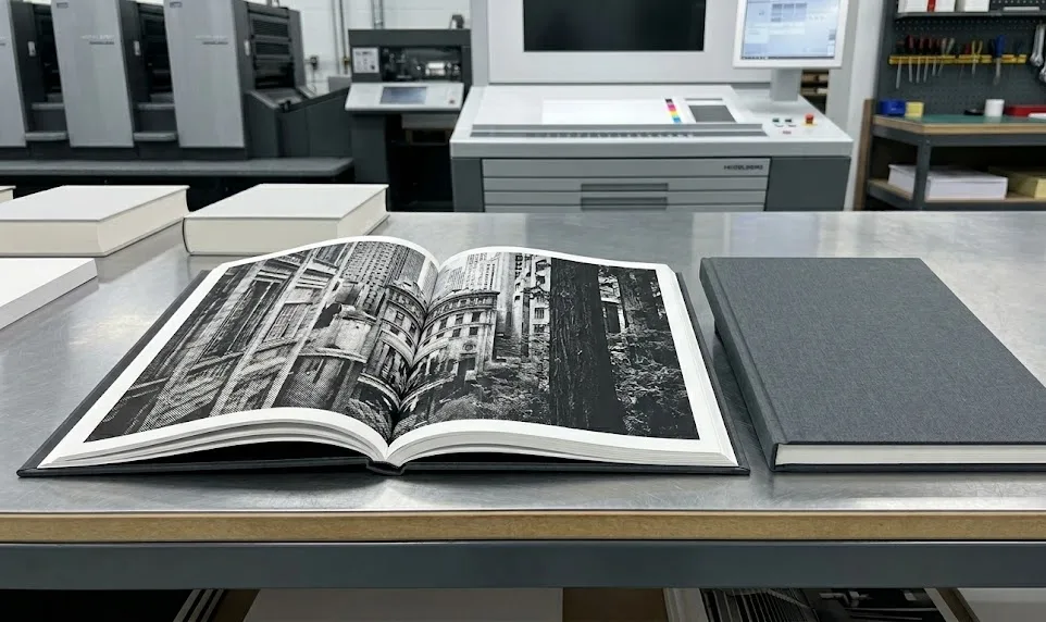
To ensure correct Book Printing Transparency, set your design software’s blend space to CMYK. Understand transparency flattening: use high-resolution presets when exporting to formats like PDF/X-1a, or use PDF/X-4 with compatible RIPs to preserve live transparency. Always preflight the final PDF.
Ready to see visual examples of common errors, detailed walkthroughs of software settings, and advanced strategies for tricky scenarios? Keep reading for the complete, actionable guide.
Why What You See Isn’t Always What Prints
So, what exactly are we talking about when we mention “transparency” in your book design? It’s more than just making something see-through!
What Exactly Is Transparency in Design?
Think of transparency as any element in your design that isn’t completely solid or opaque. This includes common and useful effects like:
- Opacity Settings: Using the slider in your design software to make text, shapes, or images partially see-through.
- Blend Modes: Effects like ‘Multiply’, ‘Screen’, ‘Overlay’, etc., which change how colors of overlapping layers interact and blend.
- Effects: Popular styles like drop shadows, inner/outer glows, and feathering (softening edges).
- Image Formats: Using file types like PNG or TIFF that have built-in transparent backgrounds or partially transparent areas (alpha channels).
These tools allow for sophisticated and layered designs, but they also introduce complexity when it’s time to print.
The Core Problem: Screen vs. Print Reality

Here’s the crucial part: the way your computer screen displays colors and effects is fundamentally different from how a printing press lays down ink on paper.
- Screens use RGB: Red, Green, and Blue light combine (additive mixing) to create colors. Screens glow, and they can display a very wide range of bright colors. Transparency on screen is essentially a calculation of light mixing.
- Printing uses CMYK: Cyan, Magenta, Yellow, and Black ink are applied to paper (subtractive mixing). Ink absorbs light, the range of achievable colors (gamut) is smaller than RGB, and colors can look different than on your backlit screen.
When your design with transparency goes to print, it needs to be translated from the screen’s RGB-like environment into instructions the CMYK printing press can understand, a core part of pre-print color management.
This translation happens in the printer’s RIP (Raster Image Processor) software. Complex transparency calculations can sometimes get lost or misinterpreted during this crucial step.
Common Transparency Printing Errors

This misinterpretation leads to those frustrating print results. Here are the usual suspects (imagine seeing these frustrating differences between your screen and the printed page!):
- The Dreaded White/Colored Box: Instead of a smooth shadow or glow, you see a noticeable, often white or off-color, rectangular box outlining where the effect should be.
- Unexpected Color Shifts: Colors in or near transparent areas look different from your design, sometimes dramatically, especially if RGB colors were mixed in or certain blend modes were used over spot colors.
- Missing Elements or Effects: Parts of an image under a transparent layer, or the effect itself, might just disappear.
- Jagged Edges or Blurriness: Text or sharp vector lines near transparency might look fuzzy or pixelated because the RIP had to rasterize that area, highlighting the importance of understanding Vector vs. Bitmap for book printing.
What is Transparency Flattening?
So, how do printers often deal with this complexity? Through a process called Transparency Flattening. Think of it as merging complex, see-through layers into simpler, solid chunks (some vector, some pixel-based) that the printer’s equipment can reliably understand and reproduce. Understanding flattening is essential, even as modern workflows evolve.
Struggling with Complex File Setup?
Our prepress experts handle the tricky details like transparency, color spaces, and flattening so your files are print-ready and error-free.
Setting Up Your Design Files for Print Success
Many transparency issues can be avoided by making smart choices during the design process, long before you even think about exporting your final PDF.
Rule #1: The Correct Transparency Blend Space
This is arguably the single most important setting. Ensure your document’s Transparency Blend Space is set to Document CMYK in Adobe InDesign/Illustrator for print projects (Edit > Transparency Blend Space > Document CMYK). Using the default RGB blend space means calculations happen in the wrong ‘language’ for print, leading to unpredictable color shifts when converted later. Set it correctly from the start!
Design with Print in Mind: “Safer” Transparency Use
Sometimes a little restraint helps:
- Simplify: Can complex layered effects be achieved more simply? Fewer interactions mean fewer risks.
- Caution with Spot Colors: Be extra careful placing transparency over spot inks (Pantone colors) – it’s a known trouble spot.
- Consider Alternatives: Could an effect be simulated with solid tints or grayscale images instead of live transparency?
Hidden Risks from Your Design Source
Often, print problems are just the tip of the iceberg; the real issues might stem from hidden problems in your design file:
- RGB Contamination: Accidentally using RGB images or colors in your CMYK print file creates chaos when transparency is applied. The necessary color conversions compound the complexity. Solution: Be meticulous – ensure all elements interacting with transparency are defined in CMYK.
- Complexity Creep: Stacking multiple transparency effects (shadow + glow + blend mode + opacity) exponentially increases the calculation load for the RIP, raising the error risk. Solution: Use complex effects thoughtfully and simplify where possible.
- Non-Professional Software “Gotcha”: Tools like Canva or Word handle transparency and color differently than Adobe’s pro software. PDFs exported from them might look fine but can cause errors at a professional printer due to non-standard internal structures. Solution: Use pro software (InDesign/Illustrator) for final print prep if possible. If not, export the highest quality PDF, check it rigorously in Acrobat Pro, consider exporting elements as images to place in a pro layout, communicate the file origin to your printer, and lean towards safer, flattened output (like PDF/X-1a).
Your Control Panel for Predictable Results
Knowing how and when to use transparency flattening gives you crucial control.
To Flatten or Not to Flatten? Making the Call
While the ideal modern workflow often involves keeping transparency “live,” flattening is still necessary or preferable when:
- Exporting to older standards like PDF/X-1a (which requires it).
- Your printer specifically requests flattened files.
- Dealing with extremely complex art where live processing might be risky on uncertain equipment.
- Troubleshooting persistent errors with live transparency.
Conversely, you might avoid flattening if exporting to PDF/X-4 and you’ve confirmed your printer uses a modern Adobe PDF Print Engine (APPE) RIP that prefers live transparency.
As experts like Dov Isaacs (formerly Adobe) often pointed out, flattening is a “destructive” process that alters your artwork’s structure and can introduce artifacts, so avoiding it when your workflow reliably supports live transparency is often ideal for maintaining quality and flexibility.
How to Flatten: The Recommended Method
Flattening during PDF export from InDesign/Illustrator offers the most control via the Transparency Flattener Presets. When exporting to PDF/X-1a, flattening is automatic based on the chosen preset.
Decoding Transparency Flattener Presets
Table Title: Key Settings: [High Resolution] Flattener Preset for Book Printing
| Setting Name | Recommended Value/Setting | Purpose/Notes |
| Raster/Vector Balance | 100 |
Maximizes preservation of vector elements (sharp text, lines).
|
| Line Art and Text Resolution | 1200 ppi |
Ensures high quality if text/line art must be rasterized.
|
| Gradient and Mesh Resolution | 300 ppi |
Sufficient for smooth rasterized effects (shadows, gradients) without bloat.
|
| Convert All Text to Outlines | Off (Unchecked) |
Generally not recommended; preserves text properties.
|
| Convert All Strokes to Outlines | Off (Unchecked) |
Generally not recommended; can undesirably thicken thin strokes.
|
| Clip Complex Regions | On (Checked) |
Recommended to minimize visual artifacts (“stitching”) at boundaries.
|
Flattening Isn’t Evil – It’s a Skill
While industry bodies like the Ghent Workgroup (GWG) rightly promote reliable modern workflows often using PDF/X-4 for its support of live transparency, don’t view flattening as obsolete. Think of high-quality, controlled flattening as a vital skill and safety net.
Understanding the [High Resolution] preset allows you to ensure predictability when facing older workflows or complex files. For critical jobs or new printers, consider the “Two-PDF” strategy: provide both a live PDF/X-4 and a flattened PDF/X-1a, letting the printer choose the safest option for their system.
Just remember: flattening is irreversible in the PDF, so always save your original design file!
Flattening Strategies for Different Scenarios
Tailor your approach based on the project:
- Scenario 1: Standard Book (CMYK, Basic Effects): PDF/X-1a (flattened) is safe; PDF/X-4 (live) is viable with a capable printer. Low risk.
- Scenario 2: Book with Spot Colors + Transparency: High Risk! Safest: Convert interacting spots to CMYK first, due to the known challenges with spot colors and transparency in many print workflows. If retaining spots: PDF/X-4 with a confirmed APPE workflow and rigorous proofing is needed. Flattening over spots is also risky. Extreme caution required.
- Scenario 3: Art Book/Graphic Novel (Complex Vectors): PDF/X-4 (live) strongly preferred to keep vectors sharp (confirm printer’s APPE workflow). If flattening, use High-Res preset and check PDF meticulously for rasterization/stitching.
- Scenario 4: Working with Older Printers/Workflows: PDF/X-1a (flattened) with the High-Res preset is likely necessary and safest.
- Scenario 5: Seeking Maximum Fidelity (Printer Supports It): Use PDF/X-4, maintain live transparency, ensure good color management, and verify printer uses a modern APPE RIP.
Common Errors & Correct Results
Imagine these common print problems versus the desired outcome:
- Case Study: Drop Shadow Box: Error: A harsh box outlines the shadow. Correct: Shadow blends smoothly. (Likely Fix: Correct flattening/color space)
- Case Study: Blend Mode Colors: Error: Overlapping colors look muddy or shifted. Correct: Colors blend as designed. (Likely Fix: CMYK consistency, careful mode choice)
- Case Study: Vanishing Alpha Channels: Error: Transparent PNG background turns white, or background under semi-transparent image disappears. Correct: Transparency behaves as expected. (Likely Fix: Correct flattening/workflow)
- Case Study: Spot Color Interaction: Error: Transparency disappears or dramatically changes color over a spot color. Correct: Predictable interaction (often requires CMYK conversion or advanced workflow). (Likely Fix: CMYK conversion, PDF/X-4 + APPE + proofing)
Inspecting Your PDF Before It Goes to Print
This last step is crucial! Always check the exported PDF file itself, not just your design app view. Use Adobe Acrobat Pro and its Output Preview tool:
- Separations Preview: Check individual CMYK and Spot color plates. Look for unexpected colors or incorrect rendering in transparent areas.
- Object Inspector: Click on elements to verify if they are vector or raster, and check the resolution of rasterized areas post-flattening.
- Simulate Overprinting: Preview how overprinting colors will interact, which can sometimes be affected by transparency handling – it’s wise to understand how to fix rich black and overprint issues separately as well.
Communicating Effectively with Your Printer
Clear communication prevents costly errors.
Your Pre-Submission Checklist:
Quickly verify these before sending:
- [ ] CMYK Transparency Blend Space?
- [ ] Fonts embedded/outlined?
- [ ] Images CMYK/Grayscale, sufficient resolution (300ppi+)?
- [ ] Bleed included?
- [ ] Spot colors handled correctly?
- [ ] Correct PDF standard (PDF/X-1a or PDF/X-4)?
- [ ] Flattening applied correctly (if needed)?
- [ ] Final PDF checked in Acrobat Pro?
Essential Print Terms Glossary:
- Transparency: Not fully opaque elements (opacity, blend modes, effects).
- Flattening: Converting transparency into simpler opaque areas for print.
- Transparency Blend Space: Color mode for transparency math (use CMYK for print).
- PDF/X-1a: Older standard, requires flattening.
- PDF/X-4: Newer standard, supports live transparency.
- RIP: Software interpreting PDF for the printer device.
- APPE: Modern RIP engine, handles live transparency well.
- CPSI: Older RIP technology.
- Spot Color (PMS): Pre-mixed ink. Risky with transparency.
- Overprint: Printing one color directly on top of another.
- Bleed: Artwork extending past trim line.
- Preflight: Checking digital files for print errors.
Your Transparency FAQ Answered
Let’s clear up a few final common queries:
Q: Does flattening always reduce quality?
A: Not necessarily visibly if done with high-resolution settings, but it does convert vectors to pixels in affected areas. The goal is a visually acceptable result.
Q: Do I have to flatten transparency?
A: Only if using standards like PDF/X-1a or if your printer requires it. With PDF/X-4 and a capable APPE workflow, you often don’t need to.
Q: I designed in Canva/Word/etc. What now?
A: These tools lack professional controls. Safest bet: Export highest quality PDF, check rigorously in Acrobat Pro, communicate with your printer, and strongly consider using a flattened format like PDF/X-1a or exporting elements as images for placement in pro software.
Conclusion

Mastering transparency might seem technical, but it’s achievable and puts you firmly in control of your book’s final print quality.
Key Takeaways Summarized:
- Set up correctly from the start (CMYK Blend Space!).
- Understand the risks (especially with spot colors and non-pro software).
- Choose your strategy: Live transparency (PDF/X-4 + APPE) or controlled flattening ([High Res] preset + PDF/X-1a).
- Always check your final PDF in Acrobat Pro.
- Communicate effectively with your printer.
By applying these practices, you directly impact your success – achieving the quality you envision, saving time and money by avoiding reprints, reducing stress through certainty, and presenting yourself professionally.