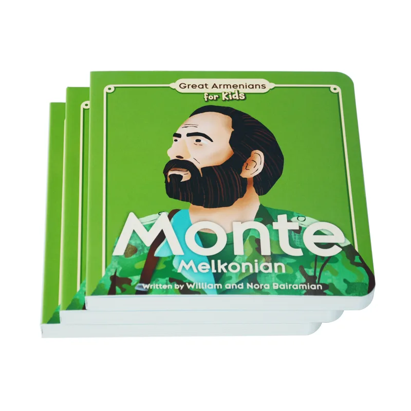
You approved a beautiful, vibrant digital sample. You were excited. Weeks later, the bulk order of 400 books arrives, and your heart sinks. The color looks dull, muddy, or just… off.
First, let’s be clear: you are not wrong, and this isn’t necessarily a “mistake.” You are experiencing one of the most common and frustrating traps in the printing industry. The issue isn’t your file; it’s a fundamental physical difference between the technology used to make your sample and the technology used to print your bulk order.
This is the digital vs. offset printing color gap.
This article will explain exactly why this happens. More importantly, we will give you a clear, three-step action plan to regain control and ensure your next print run perfectly matches your expectations.
The “Why”: Digital Toner Sits On Paper, Offset Ink Sinks In

The simplest answer to your problem lies in one word: physics. The method used to create your sample is physically different from the one used for your bulk order.
Your Digital Sample: Toner “Sits On” the Paper
Think of your digital sample (proof) like a high-end laser printer. It uses toner, which is essentially fine plastic powder. This powder is “fused” or “baked” onto the surface of the paper with heat.
Because the color sits on top, it reflects more light. This results in:
- Vibrant, saturated colors that often look brighter and “pop” more.
- Sharp details because the toner doesn’t bleed.
- Zero “Dot Gain”: The tiny dots of color don’t spread out.
This process is fast and cost-effective for a single copy, making it the default choice for most printers to provide you with a sample.
Your Offset Bulk Order: Ink “Sinks In” the Paper
Now, think of the offset press for your bulk order like a massive, high-speed rubber stamp. It uses liquid ink, not toner. This ink is transferred to the paper under immense pressure.
Unlike toner, this liquid ink doesn’t just sit on the surface; it gets absorbed into the paper fibers. This absorption is the root cause of your color shift, and it has a specific name: Dot Gain.
Dot gain is the term for the tiny dots of ink spreading out as they soak into the paper. This is not a defect; it is an inherent property of offset printing.
Here’s the critical data point: On uncoated paper, a 50% gray dot (a mid-tone) can easily spread and become a 70% gray dot. When this happens across your entire image, your mid-tones get darker, details in shadows get “plugged up,” and the whole print looks muddier and duller than your original digital sample.
| Property | Digital Sample (Toner) | Offset Bulk (Ink) |
|---|---|---|
| How Color is Applied | Fused onto paper surface | Absorbed into paper fibers |
| Key Physical Trait | Zero Dot Gain | Has Dot Gain (spreading) |
| Resulting Look | Brighter, sharper, more vibrant | Duller, softer, more “muddy” |
| Best Use | Content proofing, fast samples | High-volume production |
“Can You Make Them Match?” — The Truth About Color Matching
This leads to the million-dollar question: “Can your printer make the offset bulk order match the digital sample?”
The short, honest answer is no. It is physically impossible to make two different technologies (ink vs. toner) match 100%.
However, the real answer is that a professional printer can—and must—achieve a “commercially acceptable

match.” This isn’t just a vague promise; it’s a measurable standard. In the printing industry, we quantify color difference using a metric called Delta E (dE). Think of it as a “score” for how different two colors are. A dE under 1.0 is a perfect match, but a dE between 2.0 and 4.0 is considered a high-quality, acceptable match for most brand projects.
The mistake is trying to force the offset press to “chase” the bright, glossy digital sample. That’s the wrong way to think about it.
The correct professional method is the reverse: we make the digital proof “smarter” by forcing it to simulate the final offset print.
As printing consultant David Zwang explains:
“A proof is a promise… It’s an agreement on what the final print will look like. The disconnect happens when the proofing device (digital) and the final output device (offset) are not characterized to the same printing condition.”
A true “contract proof” isn’t just a quick print. It’s a precisely calibrated sample that simulates the offset dot gain and the exact paper stock of your final job. It may look slightly duller than a quick-and-dirty sample, but it is honest. It’s a promise that can actually be kept.
Ensure Perfect Color on Every Project
Don’t let dot gain and color shifts ruin your project. Our experts manage the entire calibration and proofing process. Get a free quote on your next book project.
Your 3-Step Action Plan to Prevent Color Disasters
Understanding the “why” is the first step. Now, here is your practical, three-step plan to take control of the process and prevent this problem from ever happening again.
Step 1: Redefine Your Proof (The “Contract”)
Stop thinking of that first, fast digital printout as your “sample.” It’s not. That is a “content proof”—its only job is to let you check for typos and layout.
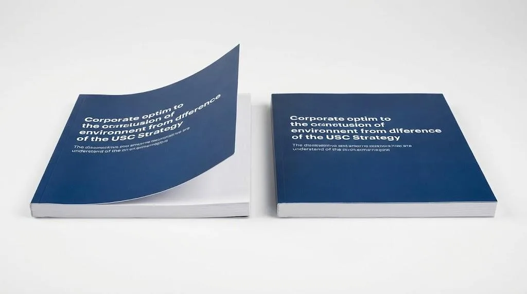
For color, you must insist on a “contract proof.” This is a high-quality proof, often from a specialized inkjet proofer, that is precisely calibrated to simulate the final offset press. It intentionally includes the dot gain and color profile of the final paper, so it will look “duller” than a simple toner print—and that’s the point. It is accurate.
We learned this lesson the hard way. Years ago, we printed a catalog for a high-end furniture brand. Their designs featured beautiful, deep walnut wood grains against dark gray backgrounds. We provided a standard digital (toner) proof, which looked sharp, and the client approved it.
The final offset run, however, was printed on their chosen matte-coated paper. The result? The natural dot gain on the matte stock “plugged up” all the shadows.
The rich wood grain details were lost in what the client rightly called a “muddy” mess. We had to admit our error—our proof had failed to simulate the paper’s behavior—and we reprinted the entire job at our own expense.
The lesson: Your proof must always be produced on, or accurately simulate, your final paper stock. A color can look perfect on a glossy sheet and completely different on an uncoated one.
Step 2: Ask About Their Color Management Process
When vetting a print partner, you don’t need to be a technical expert. You just need to ask one simple, but revealing, question:
“What is your process for managing color consistency between your digital proofer and your offset presses?”
Listen carefully to the answer. A professional partner will confidently describe their system. They should mention:
- Regular calibration of all their devices (both proofers and presses).
- Using specific color profiles (like GRACoL or FOGRA) to simulate the offset press on the proofing device.
- How they control for variables like paper type and dot gain.
If they give a vague answer like “We’ve got a great eye for color” or “We just try our best to match it,” it’s a major red flag. It means they don’t have a standardized, repeatable system.
A professional workflow is about systematic calibration—forcing two different engines (the proofer and the press) to aim for the same verified color target. An amateur just prints and hopes.
Step 3: Provide a “Physical Target” for the Press Run

Never, ever approve a print job’s color based on a PDF you see on your screen. Your monitor is a light source (RGB) and is almost certainly not calibrated. This is a common reason why your prints look dull in general.
You must approve a physical, hard-copy contract proof.
Once you sign that proof, it becomes the “physical target.” You should mail this approved proof back to your printer with your order, and clearly state: “All bulk production must match this approved hard proof.”
This physical sample is then taken by the press operator and placed at their console. As the press runs, they pull sheets and hold them directly next to your approved sample under controlled lighting. Their entire job is to adjust the ink densities on the press until the production sheet visually matches your “target.”
This signed, physical proof is your only “color contract” and the only way to ensure accountability.
Conclusion: Move from “Hoping” to “Controlling” Your Color
That frustrating gap between your bright digital sample and your final offset print run isn’t an unfixable error—it’s a predictable physical characteristic of two different printing technologies.
The disappointment you felt wasn’t a failure of printing; it was a failure in the proofing process.
By understanding that a sample (toner) and a bulk order (ink) are fundamentally different, you’ve already taken the first step. You now have the knowledge to change your workflow from one of “hoping” for a good result to one of “controlling” the outcome.
The solution is not to find a printer who promises to magically make offset ink look like toner. The solution is to partner with a professional printer who uses a calibrated, standards-based process to ensure your proof accurately predicts your final product.
Your brand’s color is your most valuable asset. Don’t leave it to chance. By insisting on a contract proof, asking about calibration, and providing a physical target, you ensure the color you approve is the color you get.
References & Notes
[1] Delta E (dE): A standard measurement, established by the International Commission on Illumination (CIE), that quantifies the perceived difference between two colors. A dE of 1.0 is the smallest difference the human eye can typically detect.
[2] Dot Gain: A fundamental property of offset lithography. It is influenced by ink viscosity, press pressure, and, most significantly, the absorbency of the paper stock (e.g., uncoated paper has much higher dot gain than coated paper).
[3] Color Profiles (ICC): An ICC profile is a set of data that characterizes a color input or output device. In printing, specific profiles (like GRACoL or FOGRA) are used to simulate the final offset press’s color gamut and dot gain, allowing a proofer to create an accurate simulation.