Frustrated by print-ready files that get rejected, or seeing your vibrant art turn dull and lifeless in the final book? This guide introduces the Defensive Design Framework, a system used by industry professionals to eliminate costly reprints and ensure a predictable, market-ready book every time.
Critical pre-press errors in children’s books involve incorrect bleed and margin setups causing key art to be trimmed off, using low-resolution images that lead to blurry printing, and improper RGB-to-CMYK color conversion resulting in dull, inaccurate colors, while ignoring gutter loss on spreads distorts central illustrations.
But spotting these errors is one thing; preventing them entirely requires a different system. This guide delivers the ‘Defensive Design’ framework that professionals use to move beyond simply following rules, allowing you to systematically eliminate these risks before they happen.
Part 1: A ‘Robust File’ Mindset Beyond the Basics
Before we dive into complex spreads and formats, let’s establish our foundation. We’ll assume you’re familiar with the basic vocabulary of print, but a final check is always a good practice. Think of this as the final pre-flight check before taking off.
Your Essential Pre-Press Checklist
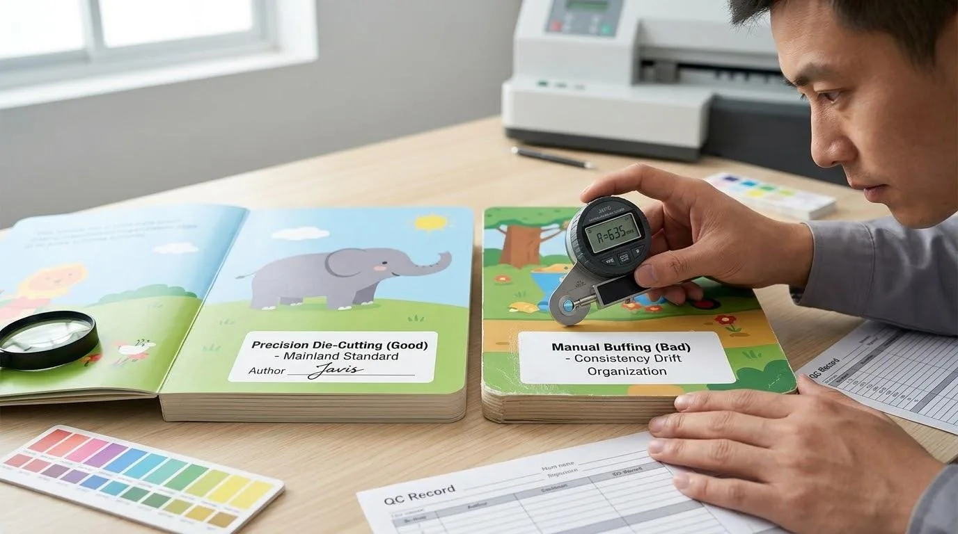
- Resolution: 300 DPI (Dots Per Inch) is the non-negotiable standard for professional printing. For illustrations with very fine lines, aim for 400 DPI to be extra safe.
- Bleed: 0.125 inches (or 3mm) on all three outer edges of your pages (top, bottom, outside). This extra margin is trimmed off, ensuring your artwork extends to the very edge of the page without any unsightly white slivers.
- Safety Margin: Keep all critical text and artwork (like a character’s eyes or a line of dialogue) at least 0.25 to 0.5 inches inside the final trim line.
- Rich Black Formula: For deep, luscious black backgrounds, don’t just use 100% Black (K). Use a “rich black” formula like C:60, M:40, Y:40, K:100. This creates a much deeper, more satisfying black on paper. For fine text, however, stick to 100% K to keep it crisp.
With the basics confirmed, we can now elevate our approach with the core concept that separates amateurs from professionals: Defensive Design.
Defensive Design: Why You Must Plan for Imperfection
Printers strive for perfection, but the physical process of printing, trimming, and binding books involves machines operating at high speeds. Minor variations are inevitable. Paper can shift, blades can trim a fraction of a millimeter off, and folds can vary slightly.
Defensive design means you anticipate this small, acceptable margin of error—this “tolerance”—and design in a way that makes it completely invisible.
Case Study: The Deadly Thin Border
A client of mine once designed a beautiful cover with a delicate, perfectly even 5mm border around the edge. In theory, it was beautiful. But in reality, the final printed books were a disaster.
Due to a tiny, 1mm shift during trimming, the border on one side of the book was 4mm wide, and on the other, 6mm. The asymmetry, though slight, was immediately noticeable and made the entire book feel cheap and unprofessional.
The mistake wasn’t the printer’s—they were within their standard tolerance. The mistake was a design that was intolerant of physical reality.
To avoid this, you must:
- Eliminate Precarious Borders: The safest and most professional approach is to design your artwork to bleed fully off the page. Let a lush background image be your “border.” If you absolutely must have a frame, make it exceptionally thick and irregular, so minor shifts won’t be apparent.
- Give Key Elements Extra Room: Don’t just place important elements on the safety line. Give them extra breathing room. Think of the safety line itself as a “warning zone” and consciously move crucial details further toward the center. This defensive buffer is your best insurance policy.
| Common Mistake | Inevitable Printing Issue | Defensive Solution | Result |
|---|---|---|---|
| Thin, even borders | Minor trim shifting (±1mm) | Use full-bleed art instead | Professional, tolerant design |
| Art placed on safety line | Combined trim/fold variance | Move key art well inside safety | No risk of being cut off |
| Key art on spine center | Gutter loss (2-3mm/page) | Design around a central “void” | Perfectly aligned spreads |
Part 2: How Do You Create a Flawless Crossover Spread?

This is, without question, the single greatest challenge in children’s book printing pre-press. You’ve created a magnificent dragon, a sweeping rainbow, or a hero reaching across the page. How do you ensure it connects seamlessly across the book’s spine instead of becoming a disjointed mess?
The answer lies in understanding and respecting a physical reality called Gutter Loss.
Embracing the “Black Hole”: What is Gutter Loss?
When a book is bound, the pages are glued or stitched into the spine. This process “pinches” the center of the spread, pulling a small portion of the paper into the binding. This “eaten” area is the gutter loss.
It’s typically only about 2-3mm per page, but it acts like a black hole, consuming whatever artwork falls into it.
Case Study: The Tragedy of the Broken-Nosed Dragon
I once worked with a brilliant illustrator who designed a majestic dragon breathing fire across a two-page spread. To create a “perfect” connection, she placed the very tip of the dragon’s snout right on the center line of her digital file.
When the proof arrived, we were horrified. The gutter loss had completely swallowed the tip of the dragon’s nose, making it look flattened and broken. The intended power of the image was shattered by a few millimeters of lost paper.
This experience taught me the most crucial rule of spreads: the physical center of the book is a void. You must design around it, not on it.
The Solution: Creating a Visual “Danger Zone”
To prevent this disaster, you must create a visual guide in your design file that constantly reminds you to avoid the center.
Here’s a step-by-step process in Adobe InDesign:
- Set Up Facing Pages: When creating your new document, ensure the “Facing Pages” box is checked. This will show your pages side-by-side, as they appear in a real book.
- Create the Danger Zone Layer: In your Layers panel, create a new layer and name it “DANGER ZONE – DO NOT PRINT.” This layer will be for guides only and will be turned off before you export the final file.
- Draw the Gutter Guide: On this new layer, draw a rectangle down the center of the spread, covering the spine. Make this rectangle 0.25 inches (about 6mm) wide—giving you a safe buffer on either side of the spine. Fill it with a bright, obnoxious color like magenta or yellow so you can’t possibly ignore it.
- Lock the Layer: Lock the “DANGER ZONE” layer so you don’t accidentally place artwork on it.
Now, as you design, you have a constant, unmissable visual reminder of the “black hole” in the middle of your spread. Your design challenge is to create a composition that flows beautifully across this gap.
- Good for Crossovers: Landscapes, background textures, a character’s long body or tail, sweeping motion lines.
- Bad for Crossovers: A character’s face, eyes, hands, or any element that requires perfect, precise alignment.
By anticipating this physical limitation from the very beginning, you transform a potential disaster into a deliberate, professional design choice.
Part 3: How Do You Set Up Files for Hardcovers and Board Books?

If you’ve only ever prepared files for a standard softcover book, tackling your first hardcover book or board book can feel like graduating from basic arithmetic to advanced calculus. The files are fundamentally different and are a major source of technical rejections from printers.
Let’s demystify the process.
Mastering the Hardcover Wrap: It’s All About the Blueprint
My first time designing a hardcover, I confidently submitted three separate files: a front cover, a back cover, and a spine. They were rejected almost instantly. The printer needed a single, massive file—a “flat wrap”—that included not only the cover elements but also the large area needed to wrap the artwork around the thick greyboard.
This experience taught me the golden rule of complex formats: Get the printer’s template first, then design. Never, ever guess.
Deconstructing the Hardcover Blueprint
To correctly build your hardcover file, you must first understand its anatomy. Imagine unfolding the entire cover into one flat piece. It consists of:
- Front Cover, Back Cover, and Spine: The three main sections you see on the finished book.
- Bleed Area: The standard 0.125-inch bleed you’re used to.
- Wrap Area: This is the critical, large extra margin—often 0.625 to 0.75 inches—that gets physically folded over the edge of the board and glued down on the inside. All of your cover artwork must extend fully into this area.
- Hinge Area: The flexible channels on either side of the spine that allow the book to open. You must keep all key text and logos out of this “no-go” zone.
The Foolproof Solution: The Template and the Calculator
Calculating the exact dimensions for this complex blueprint, especially the spine width, is where most creators get stuck. The spine width depends entirely on your final page count and the specific paper stock you choose.
To make this foolproof, we’ve created a downloadable Hardcover Spine Width Calculator.
To use it, you will need one crucial piece of information from your printer: the PPI (Pages Per Inch) value of your chosen interior paper. This is a physical measurement of how many sheets of paper equal one inch of thickness. It has nothing to do with image resolution.
Formula: Spine Width (in inches) = Total Page Count / Paper's PPI
Once you have your spine width, our calculator will help you determine the final dimensions for your complete flat wrap file.
To make this process even easier for you, we have included the Hardcover Spine Width Calculator as a downloadable tool in the checklist at the end of this article. Just plug in your numbers and let it do the complex math for you.
The Special Rules for Board Books
Board books, designed for the youngest readers, have their own unique requirements. Because they are printed on thick, non-bendable pages, their files are set up differently:
- Treated as Single Spreads: Instead of a “reader’s spread” (like page 2 next to page 3), you will typically submit each spread as a separate file (e.g., Spread 1, Spread 2, etc.), including the front and back cover as a single spread.
- Generous Corner Safety: Almost all board books have rounded corners for safety. You must keep all essential text and artwork far away from the corners to avoid them being trimmed off. A safety margin of 0.75 to 1 inch at the corners is a good defensive practice.
Part 4: How Do You Preserve Your Colors From Screen to Print?

This is where the technical meets the emotional. There is no greater disappointment than seeing the vibrant, luminous colors from your screen turn into a dull, lifeless version on the printed page. This happens because your screen and a printing press speak two different color languages: RGB and CMYK.
Your screen creates color by adding light (Red, Green, Blue), which is why it can produce such brilliant, glowing hues. A printer creates color by subtracting light with ink pigments (Cyan, Magenta, Yellow, Black). The CMYK color space, or “gamut,” is significantly smaller than the RGB gamut. As a result, about 35% of the colors your screen can display simply cannot be reproduced with standard ink.
As the late, great book designer Joel Friedlander often said, your book cover—and by extension, its overall quality—is your most important marketing tool.
The solution isn’t to abandon your vibrant style; it’s to adopt a professional color workflow that manages expectations from the very beginning.
The Pro Workflow: Work in RGB, Proof in CMYK
Forcing yourself to work exclusively in CMYK can feel creatively stifling, as many of Photoshop’s and Procreate’s best filters and effects are RGB-native. The professional workflow offers a better compromise:
- Create in Your Comfort Zone (RGB): Start your illustration in the RGB color space where you feel most creative and have the widest range of tools at your disposal.
- Constantly “Proof” in CMYK: The key is to relentlessly check how your colors will translate. In Photoshop or Illustrator, go to View > Proof Setup and select a standard CMYK profile like U.S. Web Coated (SWOP) v2. Then, toggle View > Proof Colors (Ctrl+Y / Cmd+Y) on and off. This command is your magic window. It simulates the CMYK conversion without actually changing your file, allowing you to see which of your vibrant colors are “out of gamut” and will shift in print.
- Adjust as You Go: When you spot a color that becomes noticeably duller with “Proof Colors” turned on, adjust it immediately. Find the closest, brightest equivalent that holds up in the CMYK preview.
This iterative process of checking and adjusting ensures there are no surprises. By the time you convert the final file to CMYK for export, you’ve already made all the critical color decisions.
Beyond the Basics: A Question That Signals True Professionalism
For projects where color is absolutely paramount, you can take your knowledge a step further. While most budget printing is standard four-color CMYK, many high-end printers now use six or seven-color presses that add inks like Orange, Green, and Violet to the mix. This is called Expanded Gamut Printing, and it can reproduce a much wider range of vibrant colors, closing the gap with RGB.
When vetting a potential offset printer for a large run, ask them this question:
“Do you offer expanded gamut printing options, like 6-color or 7-color printing, to better reproduce vibrant RGB colors?”
Asking this doesn’t obligate you to pay for it. But it does something powerful: it instantly signals to the printer that you are a knowledgeable, quality-conscious professional. It opens up a higher-level conversation about achieving the best possible result for your book, and it’s an insight that most independent creators don’t even know to ask about.
Ready to Create a Professional Children’s Book?
Our Children’s Book Printing services include options for premium papers, vibrant colors, and special finishes to bring your story to life.
Part 5: Your Ultimate Pre-Press Sanity Checklist
You’ve navigated the complexities of spreads, formats, and colors. Now, before you hit “Export” and send your file off, it’s time for one final, comprehensive check. Rushing this last step is like a pilot skipping the pre-flight inspection—a risk not worth taking.
To make this process as simple and foolproof as possible, we’ve synthesized all the key lessons from this guide into a single, actionable checklist. Think of this as your personal quality control tool.
We have formatted this into a convenient, you can download and print out to use for every book you create. This isn’t just a list; it’s a repeatable system for achieving professional results, every time.
Here’s a brief overview of what the checklist covers:
- Document-Level Checks:
- Correct Trim Size, Bleed, and Safety Margins set?
- Color Mode set to CMYK?
- All links to images active and not missing?
- No “DANGER ZONE” or guide layers set to print?
- Image & Artwork Checks:
- All images at a minimum of 300 DPI?
- No critical elements in the gutter or corners?
- All full-bleed art extends fully to the bleed line?
- Rich black used correctly for large areas, and 100% K used for text?
- Text & Font Checks:
- All fonts properly licensed and embedded?
- No spelling or grammar errors?
- No text in the hinge or wrap areas of a hardcover?
- Export Settings Checks (for PDF):
- Correct PDF preset selected (e.g., [Press Quality])?
- Marks and Bleeds settings correct (Use Document Bleed Settings, no printer’s marks)?
- Output settings correct (Color Conversion set to “No Color Conversion”)?
Using this checklist before every export will move you from feeling anxious and uncertain to feeling methodical and confident. It’s your final safeguard, ensuring that the file you send to the printer is a true and accurate representation of your creative vision.
Conclusion: From Anxious Creator to Confident Publisher
Mastering the art of pre-press file preparation is more than just a technical skill; it’s the final, critical step in honoring your creative work. It’s the bridge between the world you imagined and the beautiful, physical book a child will hold in their hands. The anxiety you once felt comes from a place of uncertainty, from not knowing if you’ve missed a crucial detail that could derail the entire project.
The goal of this guide was to replace that uncertainty with a system. By adopting a “defensive design” mindset, by understanding the physical realities of the book-making process, and by using a professional workflow, you are no longer just hoping for a good result—you are engineering one. You now have the knowledge to anticipate problems with crossover spreads, the blueprint to tackle complex hardcover formats, and the workflow to manage color with confidence.
Your Next Horizon: The Smart Publishing Strategy
Now that you’ve mastered creating a professional-quality book, you might be asking, “What is the smartest way to bring it to the world?” The answer for many successful independent authors is a strategic, two-track approach.
First, use Print-on-Demand (POD) platforms like Amazon KDP or IngramSpark as your low-risk market validator. Upload your flawless file, make your book available to a global audience with zero upfront inventory cost, and see if it finds its readers.
If it proves to be a consistent seller, you can then move to the second track: offset printing. With proven demand, you can confidently invest in a larger print run (1,000+ copies), which dramatically lowers your unit cost, unlocks higher profit margins, and gives you access to the superior quality and special finishes (like foil stamping or embossing) that will make your book truly stand out.
This “POD-to-offset” strategy minimizes your financial risk while maximizing your potential for profit and creative control.
You have invested too much passion and effort to let a technicality compromise your work. By implementing the strategies in this guide, you are stepping into the role of a confident, professional publisher, fully equipped to ensure your book is not just created, but crafted. Now, go and bring your story to life, exactly as you imagined it.