Tired of printed colors that don’t match your screen? This guide reveals the professional color management techniques and paper selection strategies to guarantee vibrant results. Learn the exact process used by top publishers to produce stunning children’s books.
Achieving vibrant color printing for children’s books requires designing in CMYK, using a printer with G7® calibration for consistent neutral tones, and setting the correct ICC profile. Selecting a 128-157gsm coated matte paper stock is critical for maximizing color saturation while preventing glare.
This guide moves beyond basic CMYK advice. Here, we will explore the professional standards of color management and the material science behind choosing the right paper for picture book printing. We will cover the specific methodologies and insider knowledge required to ensure the book a child holds is just as magical as the world you originally created.
Key Principles of Professional Color Management
To bridge the gap between screen and paper, you need a predictable, scientific process. Professional color management goes far beyond a simple RGB-to-CMYK conversion; it’s about controlling every variable to ensure consistent, accurate results.
Achieving Consistency with G7® Certification

You may have heard of G7 Certification, but what does it mean for your project?G7 is not a color space; it is a meticulous calibration method defined by the print industry leader, Idealliance, to ensure printing presses adhere to a global standard for neutral gray balance.
According to Idealliance, the organization that develops the standard, G7 “provides a universal calibration method that allows printers to achieve a shared neutral appearance across all printing processes.”
For you, this means quality control in book printing is built into the process. The first copy of your book will look identical to the 5,000th. More importantly, if you need a reprint a year from now, the colors will be a precise match, protecting your brand’s visual integrity.
Using ICC Profiles for Accurate Color Translation
Think of ICC profiles as individual “translation dictionaries” for every device in the creative workflow, from your monitor to the final printing press. For the most accurate results, your design files should be set to the specific ICC profile your printer uses, such as GRACoL or FOGRA.
While a digital proof is useful for checking layout, always insist on a physical hard proof. This is the only way to see how the ink will truly interact with your chosen paper stock.
Measuring Accuracy with Delta E ($\Delta$E)
How can color accuracy be measured objectively? The answer is Delta E ($\Delta$E). This is a numerical value that represents the difference between two colors—for instance, your target color and the printed result.
- A $\Delta$E of less than 1.0 is imperceptible to the human eye.
- A $\Delta$E between 1.0 and 2.0 can only be detected by a trained professional.
- For high-end art books, a printer’s ability to keep the $\Delta$E below 2.0 is a mark of true excellence. When you work with a printer who measures and controls for Delta E, you can be confident that you are getting a certifiably accurate product.
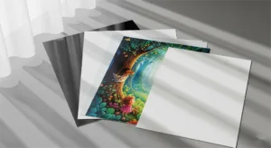
Paper Selection: More Than a Background
Paper is not a passive backdrop for your illustrations; it’s an active ingredient that fundamentally shapes the final look and feel in professional children’s book printing. The right choice enhances your art, while the wrong one can diminish it.
Understanding Paper Specifications
Before choosing a paper type, it’s helpful to understand a few key technical terms:
- GSM (Grams per Square Meter): This measures paper density and weight. A higher GSM feels more substantial and durable. For picture book inner pages, 128gsm or 157gsm is a common standard, while premium hardcovers might use 200gsm.
- Opacity: This determines how much light passes through a page. For a children’s book with illustrations on both sides of a page, you need an opacity of at least 90% to prevent the art from showing through.
- Whiteness: This measures the shade of white. As we’ll see, not all white papers are created equal, and the “whitest” isn’t always the best.
Choosing Your Paper: Coated, Uncoated, and Specialty

The most significant choice you’ll make is the paper’s finish.
- Coated Papers (Gloss or Matte): These have a sealant that prevents ink from soaking deep into the fibers. This results in sharper details and more vibrant colors. A gloss finish offers maximum color pop but can create glare, while a matte finish provides excellent color with a soft, non-reflective surface. Matte coated paper is the preferred choice for the majority of premium picture books today.
- Uncoated & Specialty Papers: These papers have a more natural, porous surface. They are perfect for creating a warm, tactile, or vintage feel. The choice of uncoated paper is a deliberate artistic decision, as explained by Caldecott-winning author Chris Van Allsburg. His use of uncoated, matte stock for books like The Polar Express is essential for reproducing the soft, deep blacks of his charcoal drawings without any distracting glare, making the paper itself part of the story’s atmosphere.
Beyond White: Matching Paper’s “Temperature” to Your Art
Here is an insight that can make a significant difference in your final product: avoid the “perfect white” trap.
Many believe the whitest possible paper is best for color, but an intensely blue-white stock can make warm-toned illustrations (featuring creamy yellows, warm reds, and soft browns) appear cold and sterile.
The expert approach is to match the paper’s “color temperature” to your art.
- For warm-toned illustrations, a Natural White or Ivory paper will harmonize with your palette, making the colors feel richer and more inviting.
- For cool-toned illustrations with crisp blues and vibrant cyans, a bright, Blue-White paper will provide the ideal canvas for maximum visual impact.
Instead of asking your printer for the “whitest” paper, ask them, “Which white is right for my art?”
From Our Pressroom: Real Stories, Real Solutions
Theory is important, but true expertise is forged in solving real-world challenges. These stories from our own experience illustrate how a knowledgeable printing partner can navigate complex issues to protect the integrity of your work.
Case Study: Rescuing the “Muddy Green” Rainforest
An independent illustrator came to us after a disastrous first proof from another printer. Her beautiful, vibrant rainforest scenes, created in RGB, had been converted to a dull, lifeless “muddy green.” We knew this was a classic case of “out-of-gamut” colors—digital greens that simply don’t exist in the standard CMYK ink set.
Instead of just running an automated conversion, our color specialist worked directly with the artist. We manually adjusted the CMYK color builds, carefully reducing the black channel and optimizing the cyan and yellow to reclaim as much vibrancy as possible.
The result was a book filled with the lush, lively greens the artist had originally envisioned. The lesson: professional color management is a hands-on process that requires an experienced eye.
Case Study: Preventing “Ghostly Black” on Textured Paper

A publisher selected a beautiful, expensive, uncoated paper with a prominent texture for a spooky storybook. Their design featured large areas of solid black. Based on our experience, we immediately flagged a potential issue. Highly absorbent, textured papers can struggle to hold a solid black, often resulting in a patchy, “ghostly” appearance.
We proactively proposed a solution: instead of a standard 100% black ink, we would use a “rich black,” a specific CMYK blend that creates a deeper, more saturated black.
We printed a test sheet comparing the two. The difference was undeniable. Our proactive approach prevented a costly and disappointing print run, delivering a book with the deep, atmospheric blacks the spooky story required.
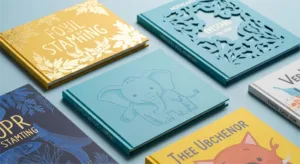
Post-Press Finishes: Enhancing Visual and Tactile Appeal

With color and paper perfected, special finishes can elevate your book from a well-made product to a memorable keepsake. These techniques add a tactile and visual dimension that invites interaction and enhances the story.
Spot UV: A clear, high-gloss varnish is applied to specific areas of your illustration. This can make a character’s eyes glisten, a raindrop look wet, or a magical object shine, creating a subtle contrast against a matte background.
Embossing & Debossing: These processes physically raise (emboss) or indent (deboss) the paper. An embossed title has a premium, three-dimensional feel, while a debossed footprint invites a child to trace it with their finger.
Foil Stamping: This technique applies a thin layer of metallic foil to the page. It’s perfect for adding a touch of magic—a golden crown, a silver star, or a shimmering wand—that catches the light and the eye.
Die-Cutting: A die is used to cut custom shapes or windows into the cover or pages. This can create a playful “peek-through” effect, building curiosity and making the book more interactive.
Tools for a Successful Print Run
Armed with this knowledge, you can approach your next print project with confidence. To help you manage the process, here are two key tools: a pre-press checklist and a framework for thinking about your budget.
A Pre-Press Checklist for Authors and Publishers
Table Title: Quick Reference: Key Printing Specifications for Children’s Books
To avoid common and costly errors, a systematic check is crucial. A thorough checklist should cover three key areas:
- File Content: Verifying final text, copyright information, and page order.
- Technical Specifications: Confirming CMYK color mode, 300 DPI resolution, and correct bleed and safety margins.
- Proofing Review: A careful, final review of the physical hard proof for color, paper, and finish accuracy.
We provide our clients with a detailed PDF checklist to guide them through every step.
Understanding Cost vs. Value in Printing
Your budget is a key factor, but the lowest price doesn’t always equal the best value. The final cost of your book is influenced by quantity, paper choice, finishes, and binding. However, it’s more productive to think in terms of return on investment.
For example, investing in a printer with G7 certification isn’t an added expense; it’s insurance against a color error that could force a reprint of thousands of books. Similarly, choosing premium paper and finishes can enhance a book’s shelf appeal, a critical factor in reader purchasing decisions, justifying a higher retail price and leading to better sales. Making smart investments in quality upfront protects your project and enhances its commercial potential.
Our Commitment to Your Project’s Success
Printing technology and machinery are merely tools. The true measure of a printing partner lies in their commitment to your project, especially when challenges arise. We operate on a foundation of trust, built upon clear principles.
Our commitment is to transparent communication. If an issue occurs, our first step is to inform you, explain the solution, and clarify any impact on your timeline. We also believe in recommending the best-value solution for your specific artwork, not simply the most expensive option.
Our goal is to build a long-term partnership by acting as an extension of your team, dedicated to protecting and enhancing your creative vision. Your success is the ultimate measure of our own.
Discuss Your Project with a Printing Specialist
Creating an exceptional children’s book requires a careful balance of art, science, and experience. From professional color management to selecting the perfect paper for picture book printing, every decision matters.
If the visual quality of your project is non-negotiable, the next step is a conversation with a specialist. Contact our team to discuss how we can ensure vibrant color printing for your children’s book and translate your unique vision into a product that children and parents will love.