Stop blurry images and costly errors in your book printing. Learn the critical difference between Vector Graphics vs. Bitmap and get actionable steps on exactly when and how to use each format correctly. Create professional, print-ready files for your book every single time.
For high-quality book printing, use Vector graphics (like AI or EPS files) for logos, text elements, and line art because they scale infinitely without losing sharpness. Use high-resolution Bitmap images (typically 300 DPI TIFF or PSD files at final print size) for photographs and complex illustrations to accurately capture detail and tones. Choosing the correct format ensures professional print results and avoids pixelation or blurriness.
Ready to dive deeper into the specific “how-to” steps, workflow tips, and common pitfalls to avoid? Keep reading…
Understanding the Fundamentals: Vector vs. Bitmap in the Context of Book Printing

Getting these two mixed up is easy, but their underlying structures are fundamentally different, and that difference has huge implications for print quality.
What is a Bitmap (Raster) Image? The Pixel-Based Reality
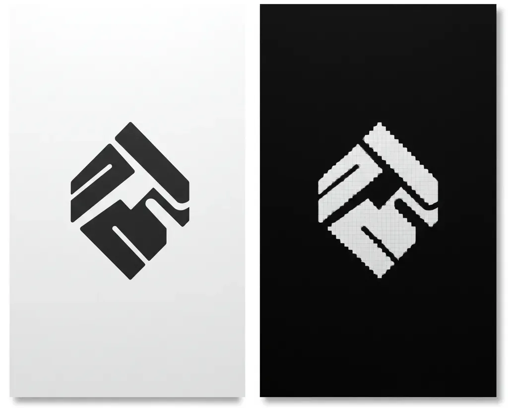
Imagine a digital mosaic – a detailed grid made up of tiny squares of color. That’s a bitmap image (often called raster). Each tiny square is a pixel.
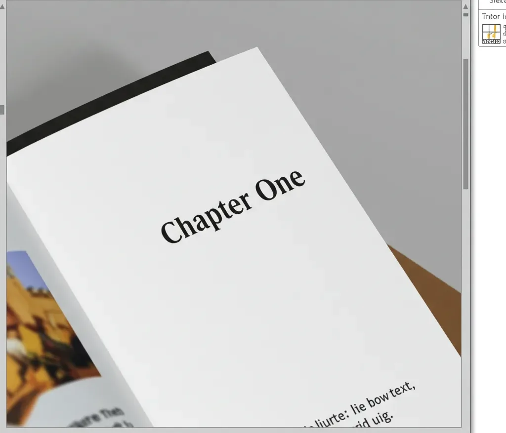
Bitmap images are defined by this pixel grid, making them resolution-dependent. They have a fixed number of pixels. Try to enlarge one too much, and you get that blurry or “pixelated” look as the software guesses how to fill the gaps.
Bitmaps excel at capturing the rich detail and subtle color transitions in photographs or complex, textured illustrations. However, their print quality entirely depends on having enough pixels (resolution) for the intended print size.
Common bitmap file types include JPG (or JPEG), TIFF, PNG, and GIF. For book printing (usually requiring CMYK color), TIFF is often preferred for quality photos due to its lossless nature, while JPG should be used cautiously at maximum quality. PNG and GIF are generally unsuitable. Remember, images found online are almost always low-resolution bitmaps unfit for quality print reproduction.
What is a Vector Graphic? The Power of Mathematical Paths
Instead of pixels, picture a set of mathematical instructions defining lines, curves, points, and shapes. That’s a vector graphic.
Vectors are based on math, making them resolution-independent. Their superpower? You can scale them infinitely – tiny or huge – and they stay perfectly sharp. This makes vectors ideal for logos, specific text elements treated as graphics, line art, simple illustrations, and charts.
Common vector file types are AI (Adobe Illustrator), EPS (Encapsulated PostScript), and SVG (Scalable Vector Graphics). PDF can also contain vector data, but beware: saving a bitmap as a PDF doesn’t convert it to vector.
Critically, as underscored by design professionals and organizations like AIGA, logos should fundamentally be created and supplied as vector graphics. This isn’t just preference; it’s vital brand practice. “Logos and brand marks should fundamentally be created as vector graphics.
This ensures infinite scalability without any loss of quality… Using a raster logo for print, especially if scaled, inevitably leads to unprofessional pixelation.” This guarantees your key brand element is always crisp.
Key Differences Summarized for Book Printing
Here’s a quick side-by-side look at what matters most for book printing:
| Feature | Vector Graphic | Bitmap (Raster) Image | Why It Matters for Books |
|---|---|---|---|
| Underlying Structure: | Mathematical Paths | Grid of Pixels | Determines scalability & detail storage. |
| Scalability: | Infinite (No quality loss) | Limited (Quality degrades when enlarged) | Logos need flexibility; photos need correct size. |
| Resolution: | Independent | Dependent (Needs e.g., 300 DPI) | Bitmaps must have enough pixels for print size. |
| Best For (Books): | Logos, Text Graphics, Line Art | Photographs, Complex Textures | Choose format based on content type. |
| Print Sharpness: | Perfect for crisp edges/lines/text | Shows tonal detail; edges need resolution | Ensures logos/text are sharp; photos look real. |
Making the Right Choice: When to Use Vector vs. Bitmap in Your Book
Knowing the difference, how do you choose? Think about the nature of each image in your book.
Use Vector Graphics For:
Prioritize vector when clarity and scalability are key:
- Logos & Brand Marks: Absolutely essential for a professional look at any size. Treat your vector logo as a core brand asset.
- Text as Graphic Elements: Designed titles or decorative text stay perfectly sharp.
- Line Art & Simple Illustrations: Ensures clean lines and shapes.
- Charts & Graphs: Keeps data visualizations clear and legible.
Why vector?: Guarantees sharpness and perfect scaling in print.
Use Bitmap Graphics For:
Use bitmap when capturing complex detail is the goal:
- Photographs: Necessary for realism and subtle tonal ranges.
- Illustrations with Complex Colors & Textures: Captures painterly effects, gradients, or photographic elements.
- Scanned Artwork: The direct output is bitmap (unless traced).
Why bitmap?: Captures rich detail. But remember: Always ensure sufficient resolution (enough pixels!) for the intended print size.
The Core “How-To”: Preparing Print-Ready Files for Book Production
Here’s where the technical details matter most for achieving quality print.
Mastering Vector File Preparation (AI, EPS, Print PDF)

For your logos and vector art:
- Font Handling: Outline Your Text! This is critical. If text remains live, the printer needs the exact font. To avoid issues, convert all text to outlines (e.g., Type > Create Outlines in Illustrator). This turns text into shapes, removing font dependency. Production Editors: make this a key check!
- Color Mode: Work in CMYK. Print uses CMYK ink, not RGB screen light; understanding pre-print color management is key. Set your document to CMYK and use appropriate profiles (like GRACoL or SWOP in North America) for more predictable color.
- Line Weights: Ensure lines aren’t too thin to print reliably (check printer minimums, often around 0.25pt).
- Saving for Print: While AI is editable, final delivery often uses EPS (ensure settings are correct) or, preferably, PDF/X standards (like PDF/X-1a). These PDFs embed information reliably for print workflows, adhering to specifications like the PDF/X standard for graphic content exchange.
Perfecting Bitmap File Preparation (TIF, PSD, High-Quality JPG)

For your photos and raster illustrations:
- Resolution Rules: The 300 DPI/PPI Standard. This is paramount for bitmap print quality. TThe standard is 300 Pixels Per Inch (PPI/DPI) at the final size it will appear in the book, a widely accepted benchmark for determining appropriate image resolution for print. As print experts emphasize, “achieving the correct effective resolution… typically 300 pixels per inch (PPI) at the final output size, is non-negotiable.” Lower resolution means blurriness. Check the Effective PPI in InDesign’s Info or Links panel, or Photoshop’s Image Size (uncheck Resample).
- Color Mode & Profiles: Use CMYK. Convert images from RGB to the target CMYK profile. Be aware some bright RGB colors may dull in CMYK.
- File Formats for Quality: TIFF & PSD Preferred. Use TIFF (lossless compression like LZW) or PSD (preserves layers) to retain maximum image quality. Use JPG only at its highest quality setting for less critical images, and avoid re-saving multiple times due to its lossy compression. Avoid web formats like PNG/GIF.
- Sizing Matters: Don’t Artificially Enlarge. Always start with an image large enough for its print dimensions at 300 DPI. Scaling bitmaps up significantly degrades quality.
Integrating Images into Your Book Workflow: Best Practices
Correct file prep needs efficient workflow management.
Managing Image Assets in Layout Software (e.g., InDesign)
For print workflows, linking image files (rather than embedding) is generally recommended. This keeps layout files smaller and makes updates easier via the Links panel.
Just ensure you keep your linked files organized and provide them all when sending files to print (packaging), following best practices for submitting book files for printing.
Clear Communication: Standards & Questions
Misunderstandings cause delays. Prevent workflow friction:
- Production Editors: Provide clear Asset Delivery Specs (required formats, resolution, color space, font outlining rules).
- Self-Publishing Authors: Ask specific questions: “Is the logo vector (AI/EPS) with outlined fonts?”, “Is this photo 300 Effective DPI?”, “Are images CMYK?”
The Power of Preflight: Catching Errors Early
Use software tools to check files before sending them off:
- InDesign’s Preflight panel: Set up profiles to flag low resolution, RGB color, missing fonts, etc.
- Acrobat Pro’s Preflight tools: Verify print standards (PDF/X), check resolution, ink limits, and more in your final PDF. Proactive checks save time and prevent costly reprints.
Avoiding Pitfalls & Troubleshooting Common Problems
Know the common traps to avoid them.
Top 5 Common Mistakes in Book Printing Files (and How to Prevent Them)
- Using Low-Resolution Web Images: Result: Blurry print. Fix: Source high-res or vector originals.
- Incorrect Color Mode (RGB): Result: Unexpected color shifts. Fix: Convert properly to target CMYK profile.
- Fonts Not Outlined in Vector Files: Result: Incorrect font display. Fix: Outline all text in vector files before final save.
- Logo Provided as Raster (JPG/PNG): Result: Lack of sharpness, poor scaling. Fix: Obtain/recreate proper vector version.
- Excessively Scaling Bitmaps Upwards: Result: Pixelation, blurriness. Fix: Use bitmaps at or near final size (at 300 DPI).
Knowing these common pitfalls is crucial; read more about the key printing mistakes to avoid in your book to ensure a smooth process.
Your Final Pre-Submission Quality Control Checklist
One last check before sending files to print:
- [ ] Bitmaps ≥ 300 Effective PPI at print size?:
- [ ] All images & colors in correct CMYK mode/profile?:
- [ ] All text in vector files outlined/converted to curves?:
- [ ] Logos/line art are definitely vector format (AI, EPS, vector PDF)?:
- [ ] Files saved in printer’s preferred format (PDF/X, TIFF, EPS)?:
- [ ] No bitmaps excessively scaled up?:
- [ ] Is bleed applied correctly if needed?:
Why Getting Vector vs. Bitmap Right Really Matters
This isn’t just about technicalities; it impacts your project’s success.
The Hidden Costs of “Fixing It Later”
Relying on fixes downstream is risky and expensive:
- Time: Fixing issues causes delays, potentially impacting launch dates.
- Money: Printer prepress time is billable; reprints are costly, so it’s wise to explore ways to reduce your book printing costs.
- Quality: Fixes are often compromises, resulting in suboptimal quality.
- Relationships: Constant file problems strain relations with printers/designers. Investing time upfront in correct file prep is far more effective.
Protecting Your Brand Equity: The Long-Term Value of Correct Formats
Especially for authors, visual consistency builds your brand:
- Professionalism: Crisp, correct graphics signal quality and care. A blurry logo undermines credibility, even subtly. Avoid the “good enough” trap; small compromises accumulate.
- Future-Proofing: A proper vector logo is a one-time investment reusable across books, websites, and marketing, always ensuring quality. Treat it as vital brand infrastructure.
Bringing It All Together
So, there you have it – a focused guide to using Vector Graphics vs. Bitmap effectively for professional book printing. By understanding the core differences, knowing when to use each, preparing them meticulously, and integrating checks into your workflow, you’re well on your way.
Applying these principles helps you avoid costly errors, streamline production, and ensure your book achieves the high-quality, professional finish it deserves. Go forth confidently and make your next book visually stunning!


