When a monograph, gallery catalog, or coffee-table program must look right under gallery light and still feel right in the hand, paper choice is a production decision—not a late aesthetic preference after files are “final.”
An art book paper guide starts with the artwork medium, then coated vs uncoated, then matte/satin/gloss. Approve the stock on a printed sample of your images—never treat gsm alone as color quality.
You will leave able to route photography, watercolor, ink, and illustration to a stock family, separate true uncoated fiber from low-glare coated finishes, and freeze a sample checklist before the first production PO.
Match Paper Stock to Artwork Medium
Match art book paper to the medium first—coated stocks usually hold photography detail; uncoated softens watercolor, ink, and tactile fine-art pages.Use this when you are locking interior stock for a gallery catalog, monograph, or coffee-table art book before color proofing. This guide does not promise a single perfect stock for every medium; confirm the printable stock list and coating on the RFQ.
Use this matrix when the brief still says “nice paper” but the work mixes photography with ink wash or illustration. Read it as a routing aid, then confirm what the plant can actually run for your trim and binding.
| Artwork medium | Stock direction to test first |
|---|---|
| Photography / high-detail color | Coated (gloss or satin/matte) so ink holds detail and blacks stay dense |
| Watercolor / soft washes | Often uncoated or soft-touch coated—mute bloom, keep fiber feel |
| Ink / calligraphy / line-heavy pages | Uncoated or low-glare coated; watch show-through on heavy blacks |
| Illustration / flat color blocks | Coated satin/matte for even fields without mirror glare |
If budget shape still undecided while paper is open, park run-size math on the art book cost shape page—this guide stays on stock and finish.
Red flag: locking a cover cloth or foil story before the interior coating family is named—those finishes sit on different proof loops.
Write the medium mix on the RFQ in one line: “hero photography + ink chapter + caption text.” Plants quote differently when they assume a single photography stock for the whole book. Measure opacity on a duplex test sheet before you approve a thin uncoated for heavy black plates.
Ask the plant to mark which stocks are floor standards versus special-order. Special-order sheets can erase a schedule even when the swatch looks perfect. Keep one owner for coating-family freeze so design cannot reopen matte vs gloss after plates are booked.
Choose Coated vs Uncoated for Sharpness and Touch
Coated stocks keep ink nearer the surface for sharper detail and denser blacks; uncoated stocks absorb more ink for a softer, more tactile page—pick that split before you argue matte versus gloss. Apply this when the team is still debating “photo paper” versus “art paper” for the same book.
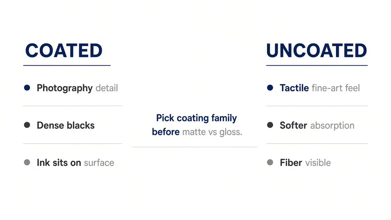
Coated is the usual path for photography-led art books and image-dense catalogs. Uncoated paper art book printing is a deliberate choice when the hand-feel and muted absorption matter more than maximum pop—common for poetry-plus-photo hybrids and some fine-art editions.For a neutral primer on how ornamented and image-led pages sit in print history, skim art book basics, then bring the talk back to your coating family.
After paper family is shortlisted, use the art book open binding to choose layflat, Smyth-sewn, or perfect bound for your heaviest crossover.
Pass / Fail cue: if two quotes disagree on coated vs uncoated while claiming the same visual target, freeze the coating family before you compare unit prices.
Check show-through with the heaviest image spread placed back-to-back. If captions sit on the reverse of a full-bleed photo, coated with higher opacity usually wins even when the creative team prefers “natural” fiber. Record the coating choice on the same line as trim size so freight and spine math stay honest.
When binding uses PUR or EVA, confirm adhesive compatibility with coated interiors—some plants switch glue families when coating changes. That is a production note, not a design preference.
Decide Matte vs Gloss Without Confusing Uncoated
Treat matte and satin as coated finishes—not as synonyms for uncoated—so glare and ink hold are decided after coated vs uncoated.Apply this when stakeholders ask for “matte paper” but mean either low-glare coated stock or truly uncoated fiber. Finish names vary by mill; matte/silk/satin labels in this guide are planning language, not a guarantee of an identical brand sheet.
Gloss maximizes sheen and contrast under spot lights; satin/matte coated keeps more of the color pop with less mirror bounce for gallery browsing. Uncoated is a different branch—no coating to fill the fibers—so colors read softer and the page writes and feels more like fiber.
Watch-out: requesting “matte” in an email often produces three different sheets across plants—one low-glare coated, one dull/silk, and one uncoated. Write coated or uncoated first, then the sheen name.
Use this sheen checklist only after coated vs uncoated is frozen:
- Gloss coated — max contrast under spot lights; watch fingerprint and glare at openings
- Satin / silk coated — color hold with less mirror bounce for browsing
- Matte / dull coated — still coated; low glare, not the same as uncoated fiber
- True uncoated — no coating fill; softer color, more tooth, different show-through math
For mixed books, you may run coated image sections and uncoated text sections only when binding and pagination plans allow a clean split—otherwise pick one interior family and prove it. Hold the sample under the same lamp angle you will use at the opening; glare that looks fine on a phone photo can fail in a bright white cube.
Name the sheen only after the coating family is frozen—matte cannot rescue an uncoated sheet that needed coated density.
Lock GSM and Sample Checks Before Color Approval
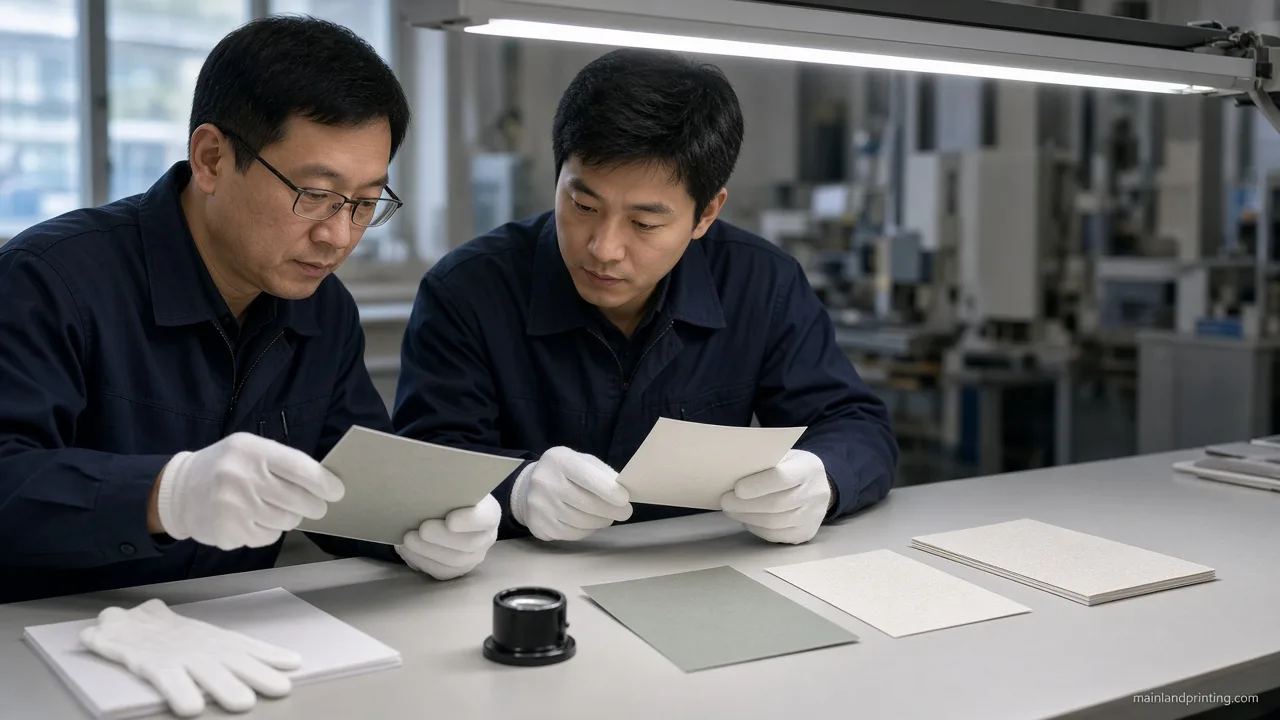
Approve paper on a printed sample of your images—gsm and coating describe structure, not a screen-to-paper color match.Use this after you shortlist coated or uncoated and before you release the first production PO. Common full-color art-book bands around 170–200 gsm gloss or satin are program-dependent; confirm the band with the plant—do not treat gsm as color quality.

Use this checklist when the stock shortlist is down to one coating family and you still need a go/no-go before plates or digital capacity is booked.
| Sample check | What to freeze |
|---|---|
| Hero image + deepest black | Detail hold, black density, and any bronzing under store light |
| Show-through on heavy coverage | Opacity acceptable for your page count and duplex images |
| Glare at intended display angle | Gloss vs satin/matte under the same lamp you will use |
| Hand-feel vs brand story | Fiber tooth vs slick coated—matches the edition positioning |
| GSM / basis weight band | Structure and opacity only; re-proof if you change coating |
If slipcase or tray geometry is already in the brief, keep structure math on slipcase budget checks so paper approval does not absorb packaging engineering.
Industry short-run and offset guides still treat coated 80–100 lb text (and heavier luxury bands) as the photography default, and they still send physical sheets before long runs—use that as process discipline, not as a copied brand SKU list.Measure the approved sheet’s caliper if spine width is already quoted; a gsm bump can change case thickness without anyone noticing until covers warp.
Red flags before you release the first production PO:
- Screen PDF approved as the only color reference
- “Matte” written without coated/uncoated
- GSM changed after sample sign-off without a new print
- No hero-black check under the real display lamp
- Special-order stock with no lead-time note
Name an owner for sample sign-off and an owner for coating freeze. If either is blank, pause the PO. Buyer RFQs for art books repeatedly surface material and sample gates—treat those as the minimum pack beside medium and sheen.
Ready to plan an art book paper review?
Send medium mix, coated/uncoated preference, target gsm band, and whether you need a bound hardcopy proof—we align printable stocks before production.
Freeze Your Art Book Paper Spec
Freeze the art book paper spec when the medium map, the coated vs uncoated choice, and the printed sample all name the same family—and when gsm is treated as structure, not as a screen-match promise. That gate is what lets you brief binding and covers without reopening interior stock.
Keep the approved swatch ID beside proof sign-off. If coating or gsm changes after approval, re-run the sample checks before you enlarge the PO. For production-ready art book printing on that locked paper pack, send the review request above to Mainland Printing.